Imobiliária

Selling Spaces

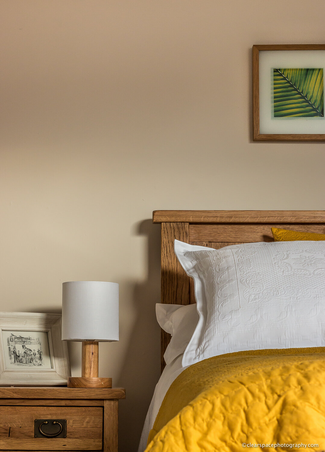
cumbrian-real-estate-interiors-bedroom-clear-space-photography-1.jpg

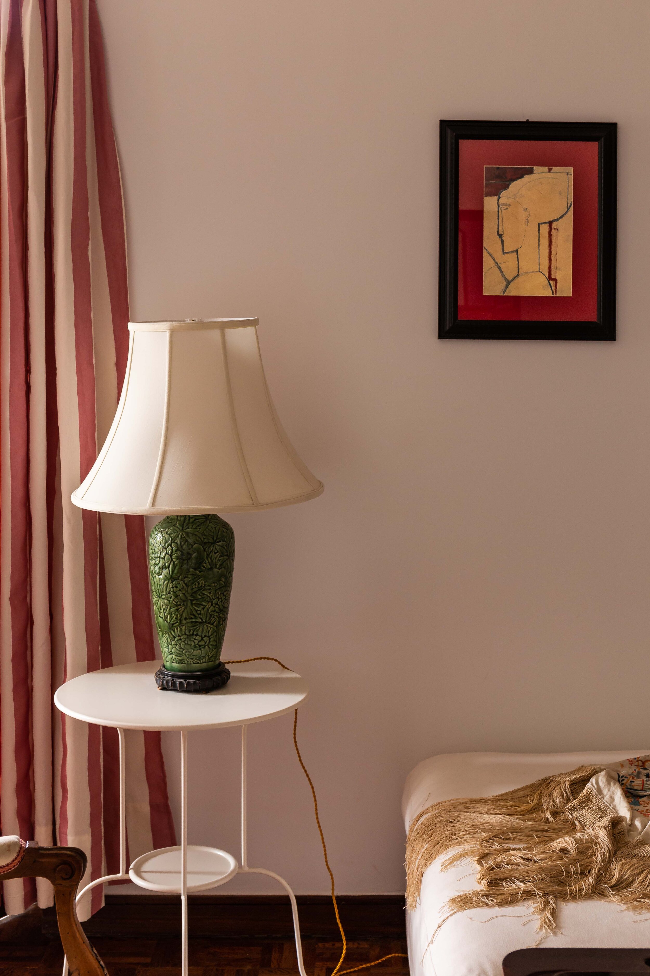
One thing that hasn’t really slowed down too much during the Covid-19 pandemic is the real estate market. Certainly here in Portugal, buying, selling, building and renting properties has continued. Some things have had to change of course, such as restrictions on viewings during the most severe phases of lockdown, but agents and brokers have adapted by making better use of media to provide a showcase of their listings to potential buyers and investors.

This of course brings me to the subject of real estate photography… 

Photography has been the mainstay for real estate marketing and with good reason. We are drawn to images of beautiful things. BUT, in a world where we are saturated with images everywhere, it is vital that the images you use to promote your property listings (and your brand) really stand out from the crowd. Lets look at some stats:

  • 99% of Millennials are searching for their future property online where a listing with pictures is 10x more consulted.*

  • Buyers spend 60% of their time looking at listing photos, and only 20% on the listing description.**

  • Homes with high-quality photos receive a 47% higher asking price.*** Listings with professional photos get 118% more online visits.****

Simply put: Professional photography gets you and your listings noticed!

[* Digital Age Study ** Wall Street Journal *** Redfin **** National Association of Realtors]

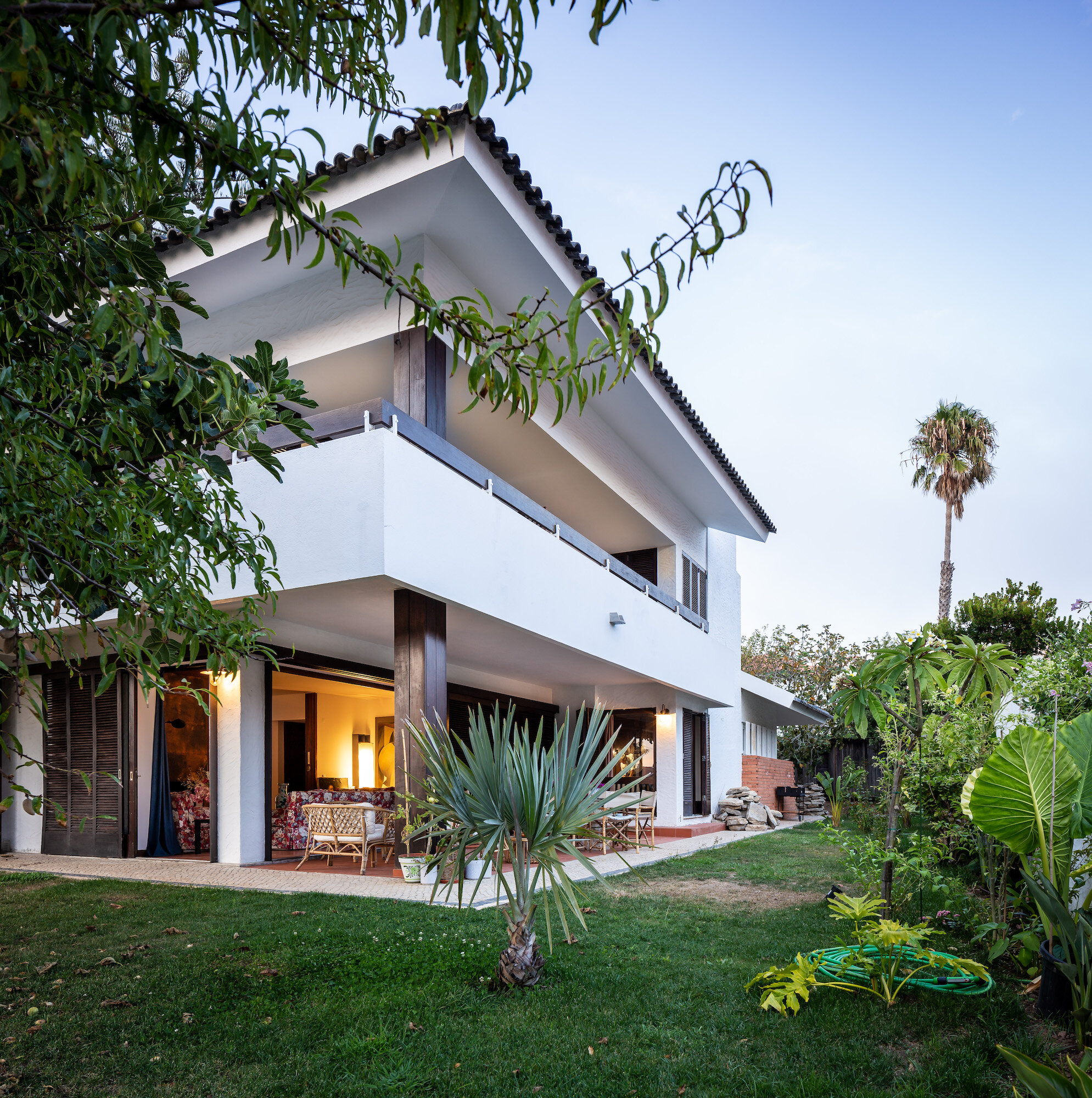
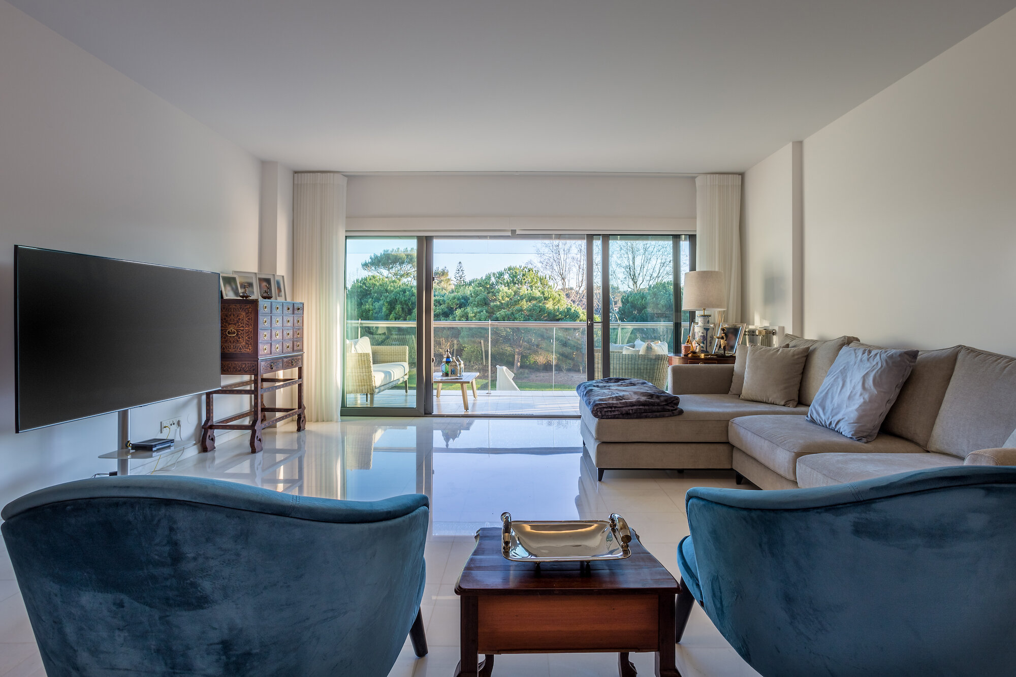
Real Estate (RE) photography is quite a different genre compared to Architecture and interior design photography. Fundamentally, its pictures of buildings, but in reality, their purpose sets them apart. A set of RE images aim to communicate a summary of a property to a potential buyer, to provoke their interest in wanting to find out more, reach out to the vendor/agents and ultimately take the step of requesting a viewing. From the agents perspective, good images also help to qualify their prospects saving everyone time.

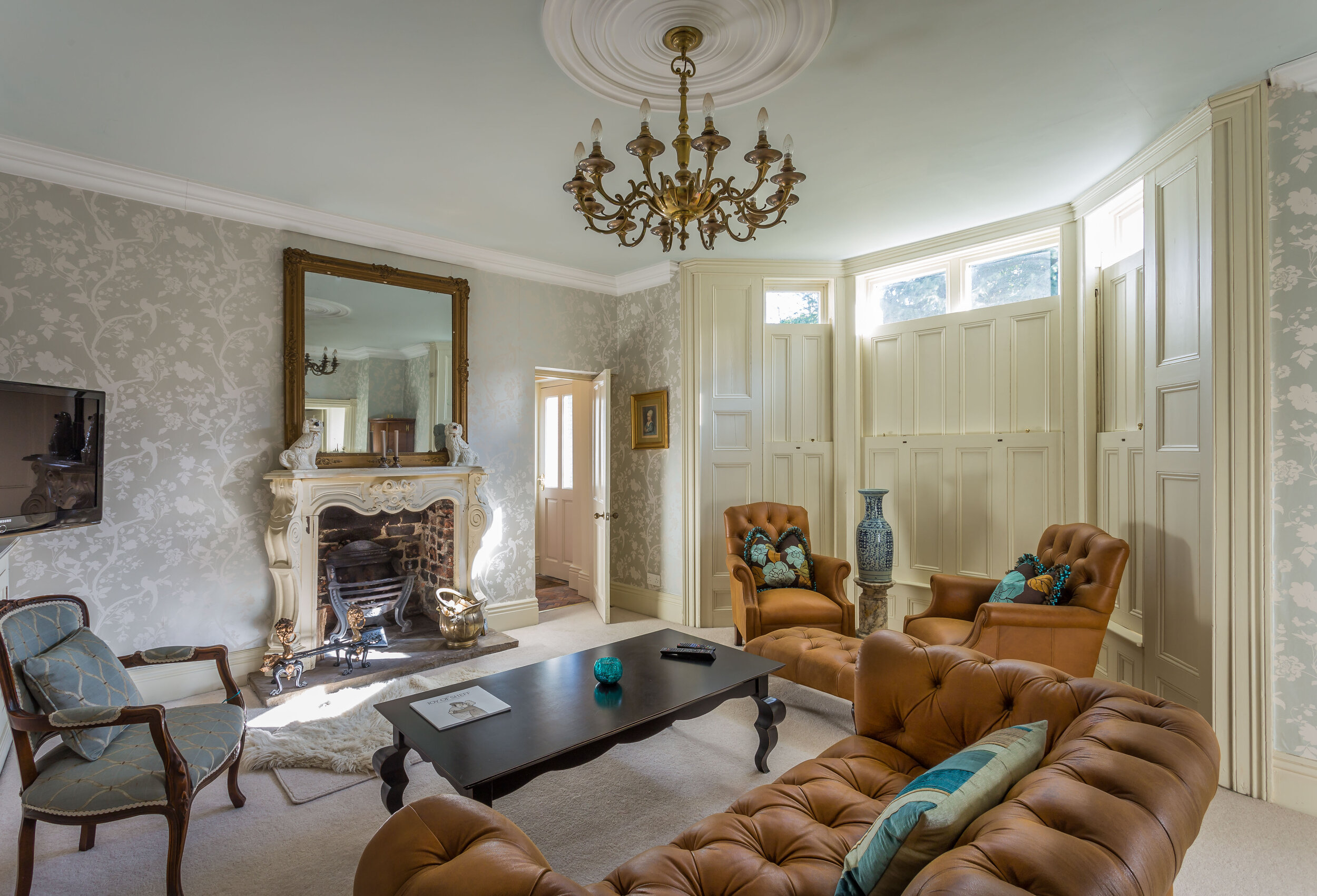
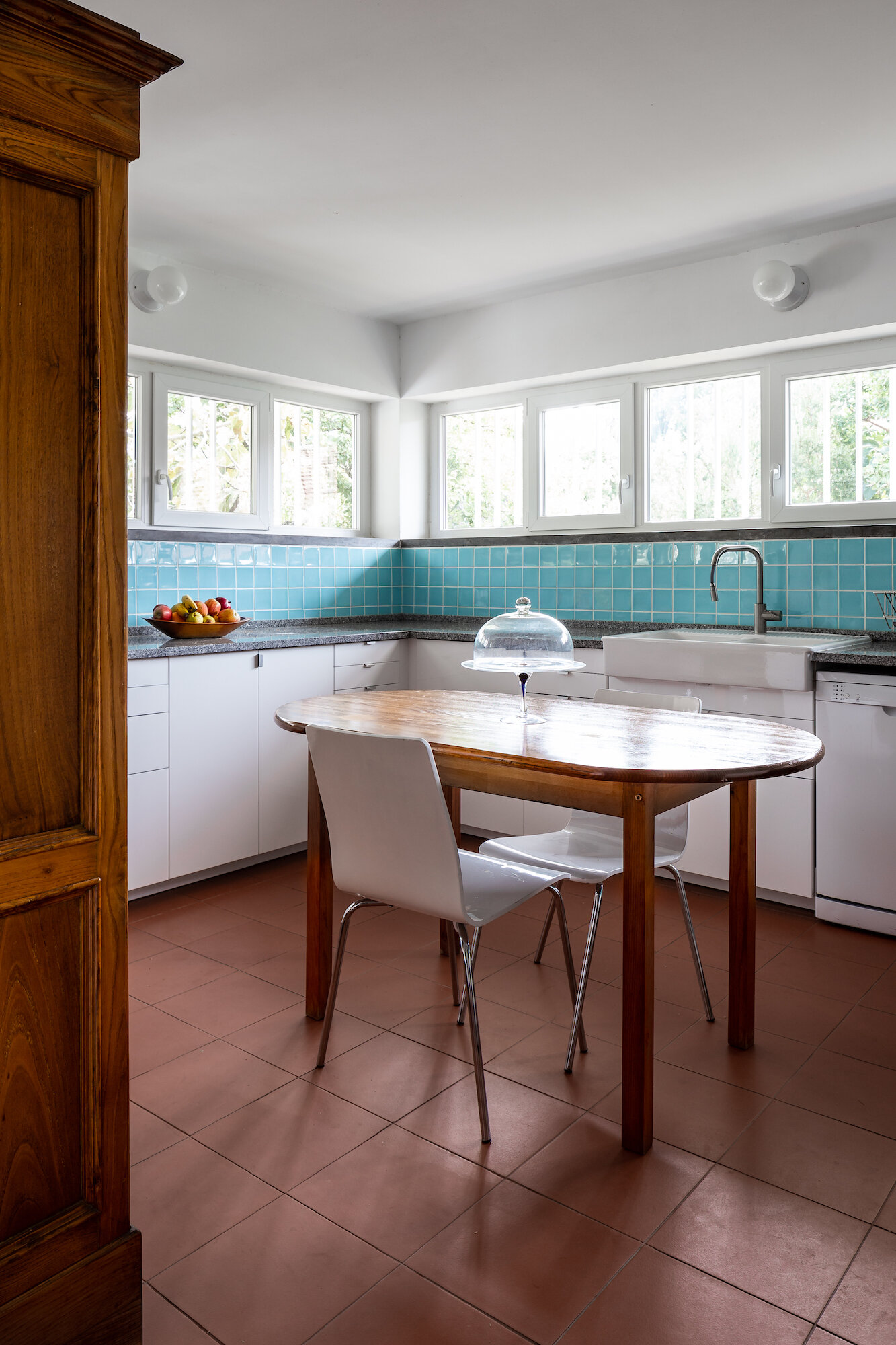
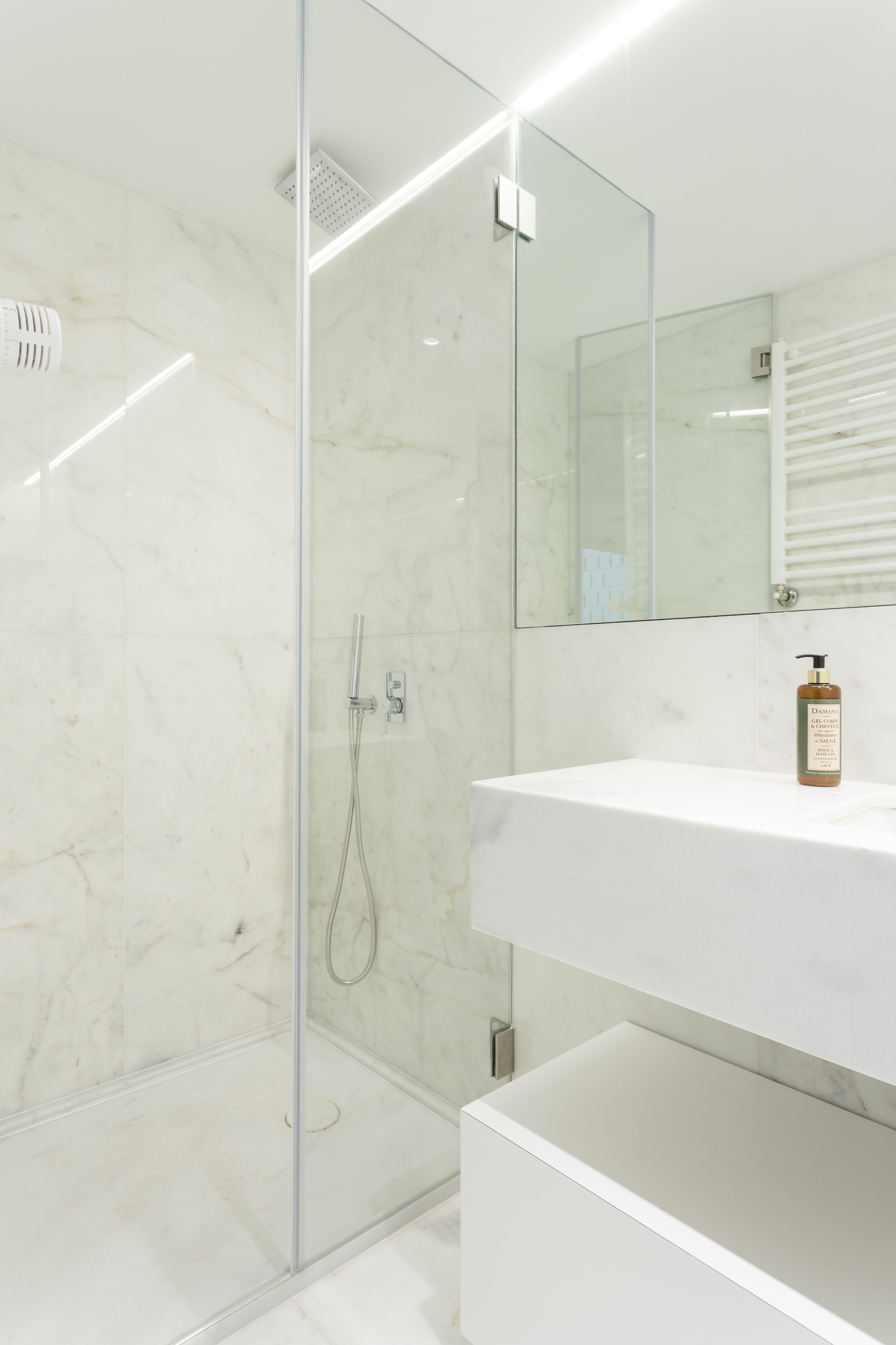
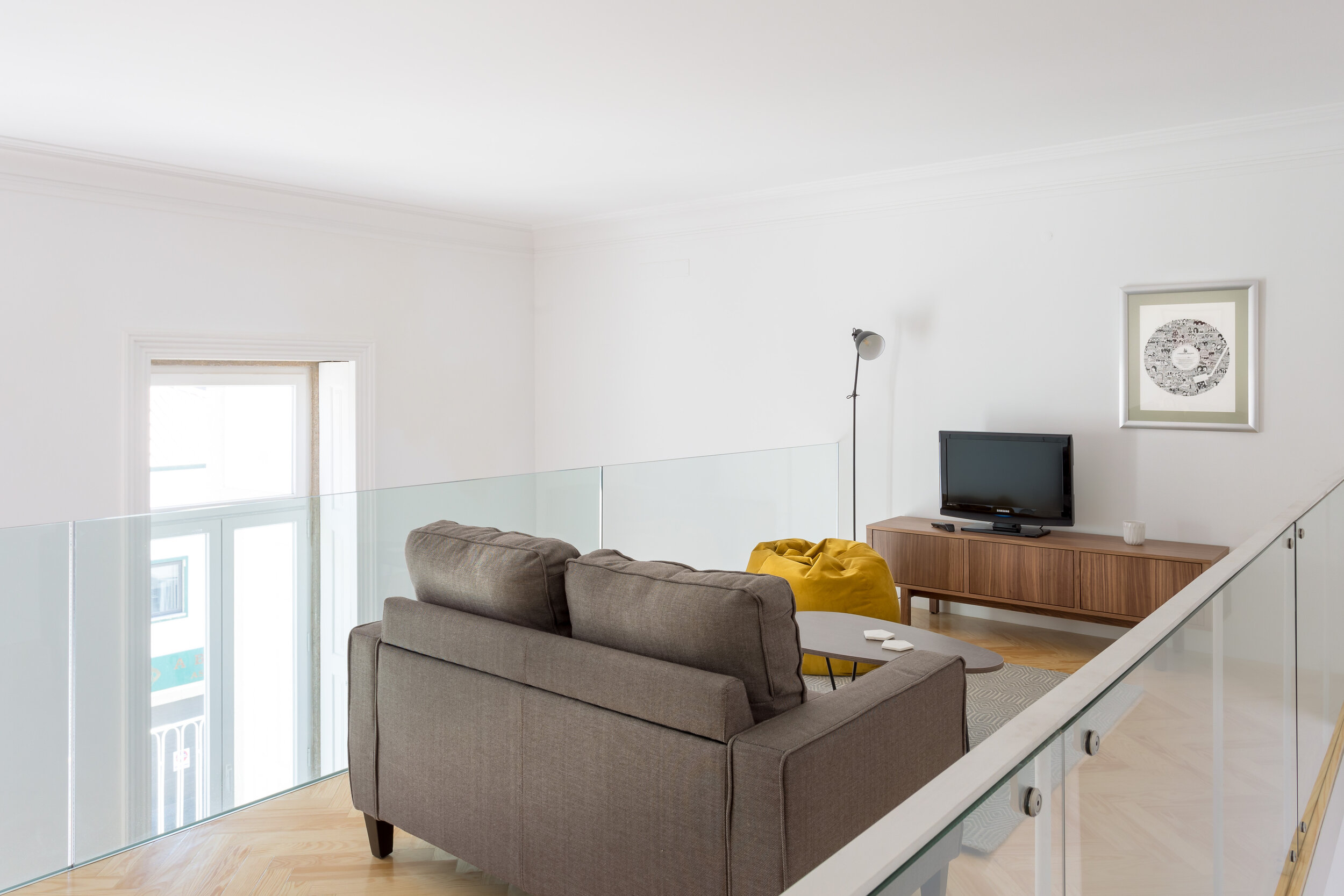
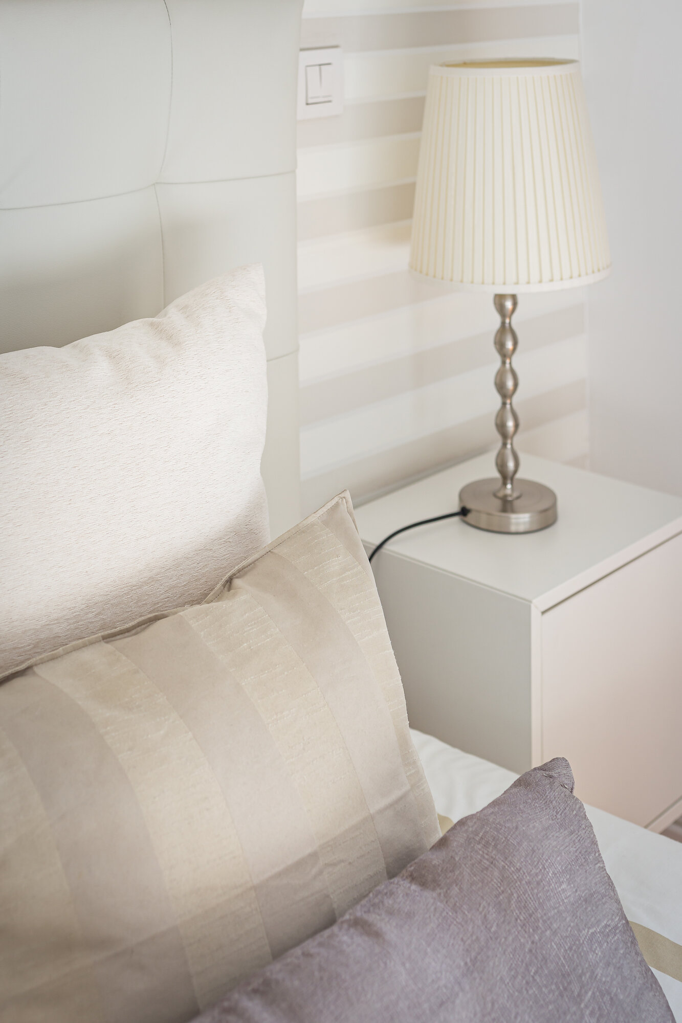
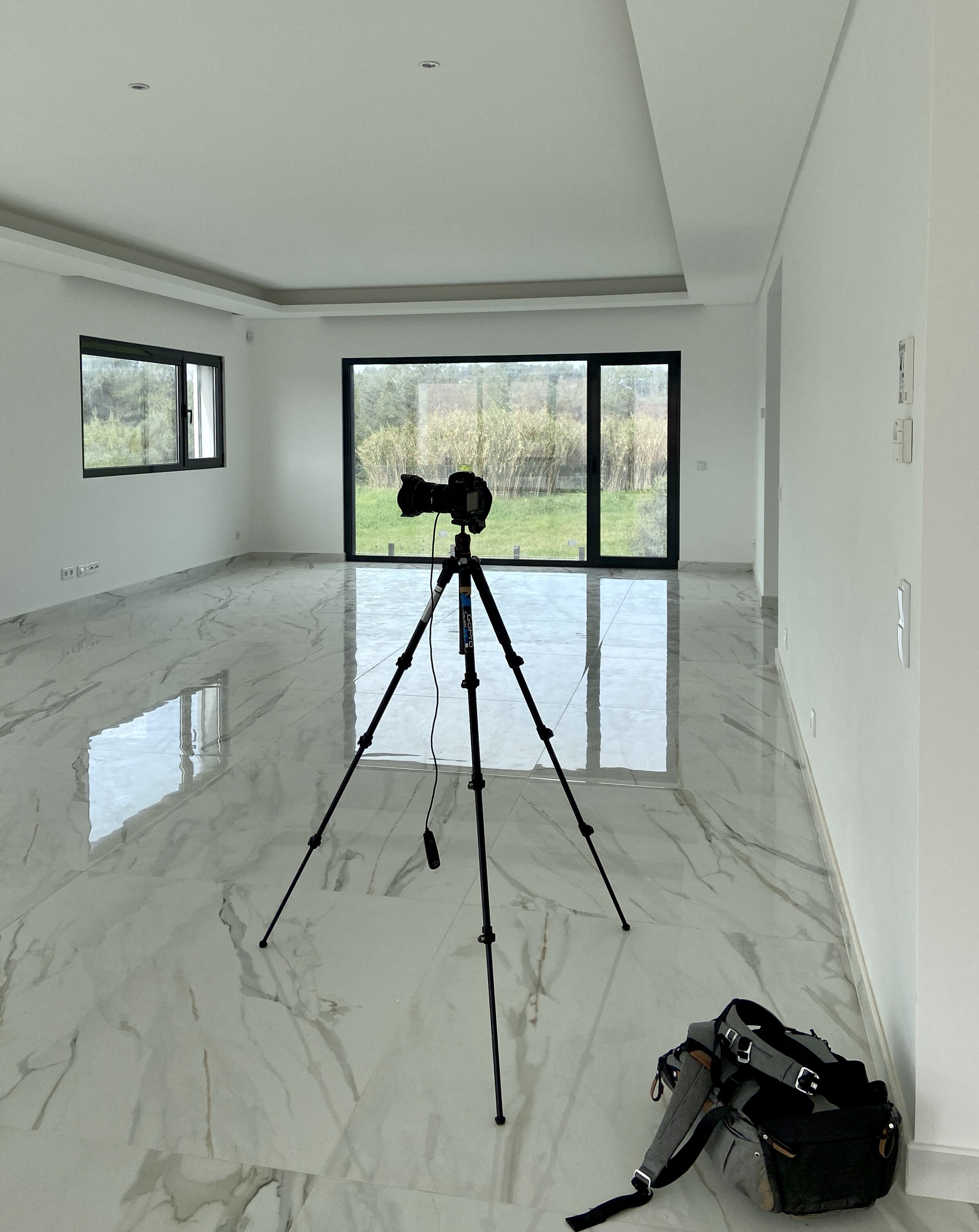
Photographically, there are some similarities in approach to creating images for RE vs architecture clients: Carefully considered compositions that tell the story and illustrate the layout and flow of the property is key. Using tripods and the right lenses to ensure good quality interior images, upright verticals and consistency across the image set. Some degree of post processing is also required. Typically for RE photography, a wider focal length is used to convey the size of each room and in order to comply with online listings websites, a horizontal/landscape orientation is favoured. Post processing RE images is a more light handed affair as the images must accurately reflect the property. However, dealing with mirrored bathrooms and high dynamic range challenges still requires a problem solving approach and pre-visualisation as well as a helping hand from Photoshop.

At Clear Space, we use our knowledge, experience and tools to help agents and vendors who understand the importance of quality imagery to promote their luxury listings through well crafted photographs. 

If you are a real estate agency looking to raise the bar of your listings, drop Clear Space a line to request a brochure and see how we can help you.

Memories

Documenting a historical residence in Cascais

Cascais-residence-interiors-11.jpg

As you’d expect, I love looking at pictures. I think most of us do, especially when they have a personal meaning such as old family photos or that painting grandma used to have above her fire place. Such pictures or photographs can instantly take us back to a different time in our lives which is pretty amazing. Most photographers would probably agree that for their images to evoke such personal memories and feelings for others is very gratifying. In my commercial photography work, there is typically a clear brief as to what we (myself and the client) want to create and how it will be used (for example, documenting a unique design element in a residential new-build for an architectural award submission).
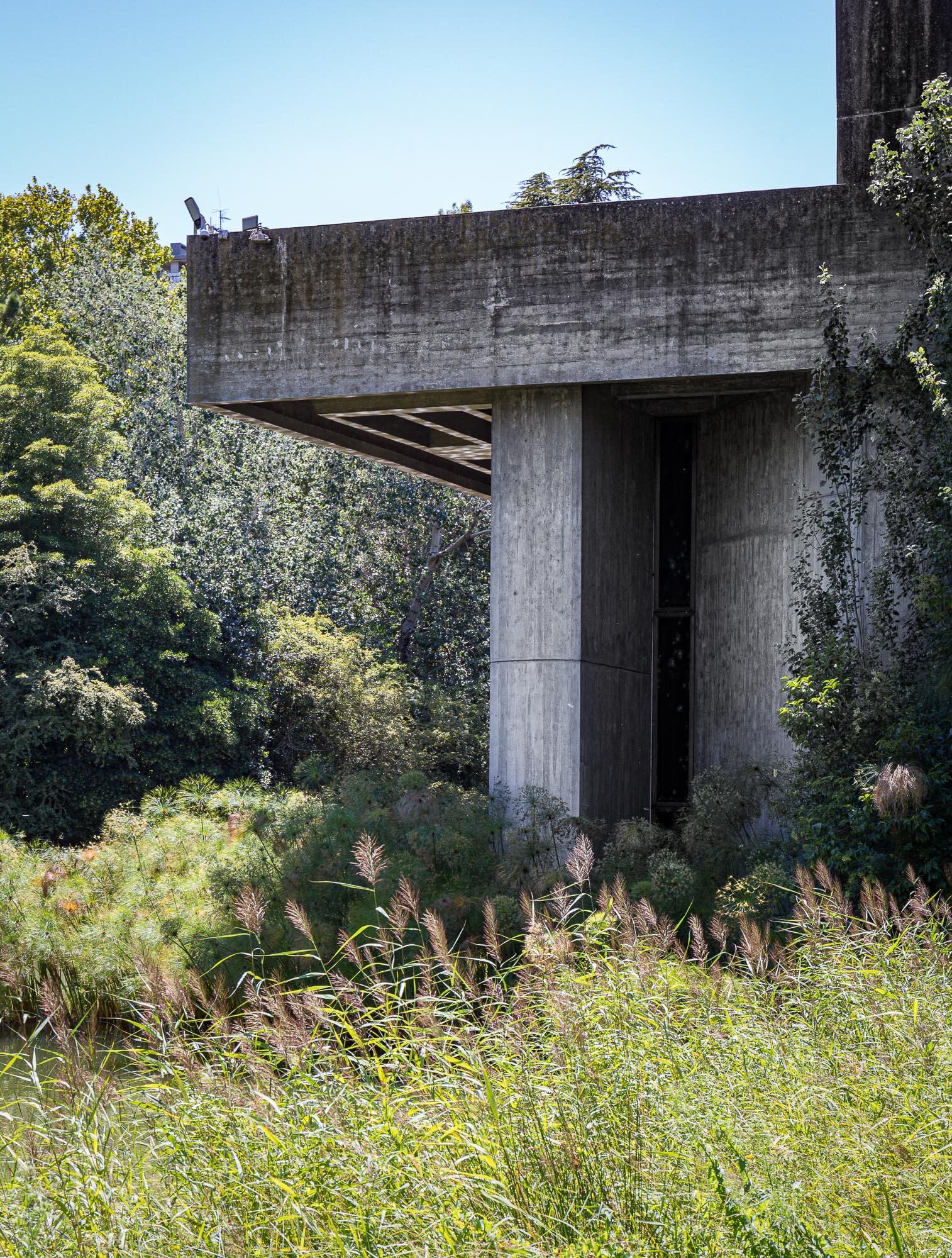
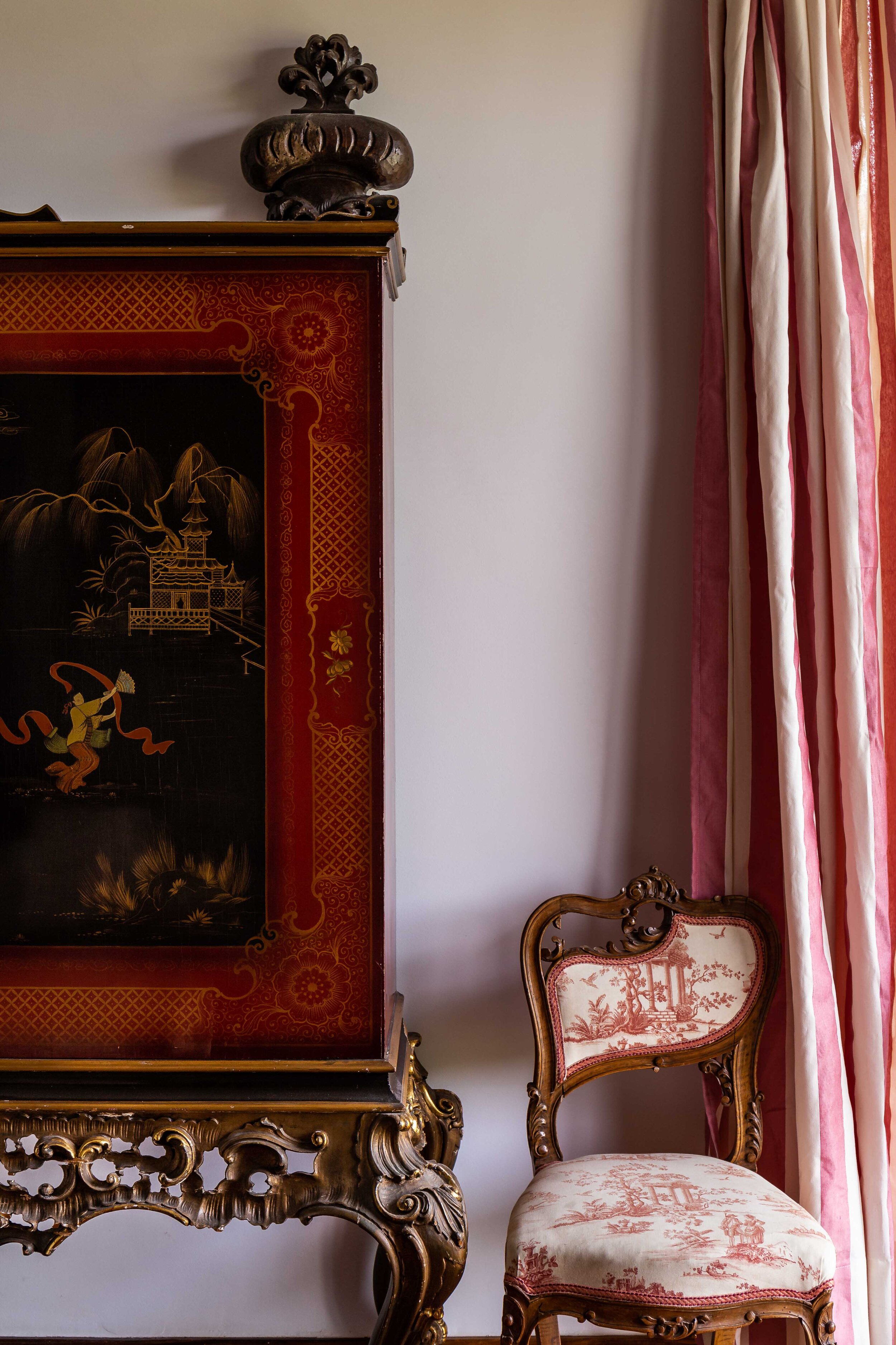
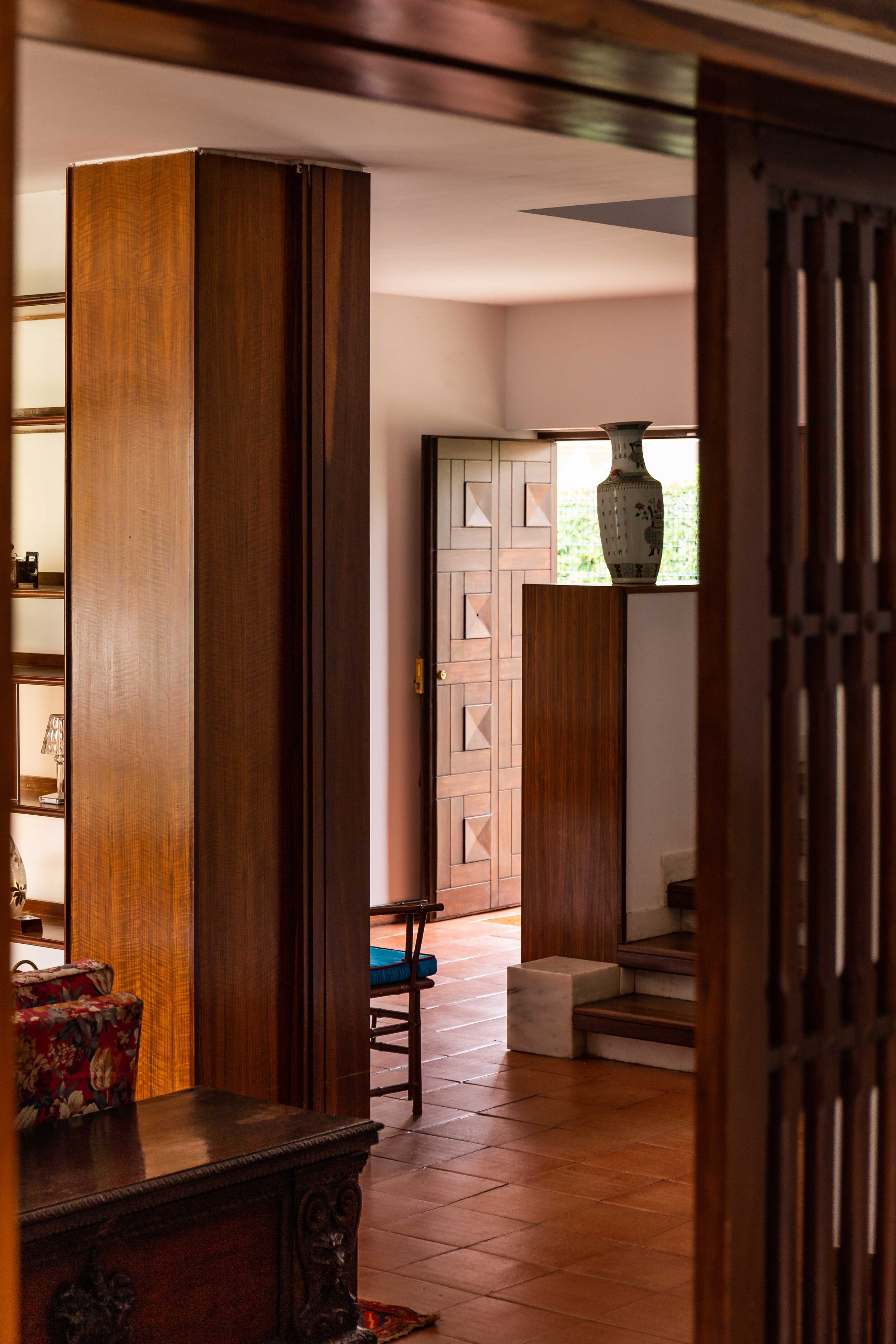
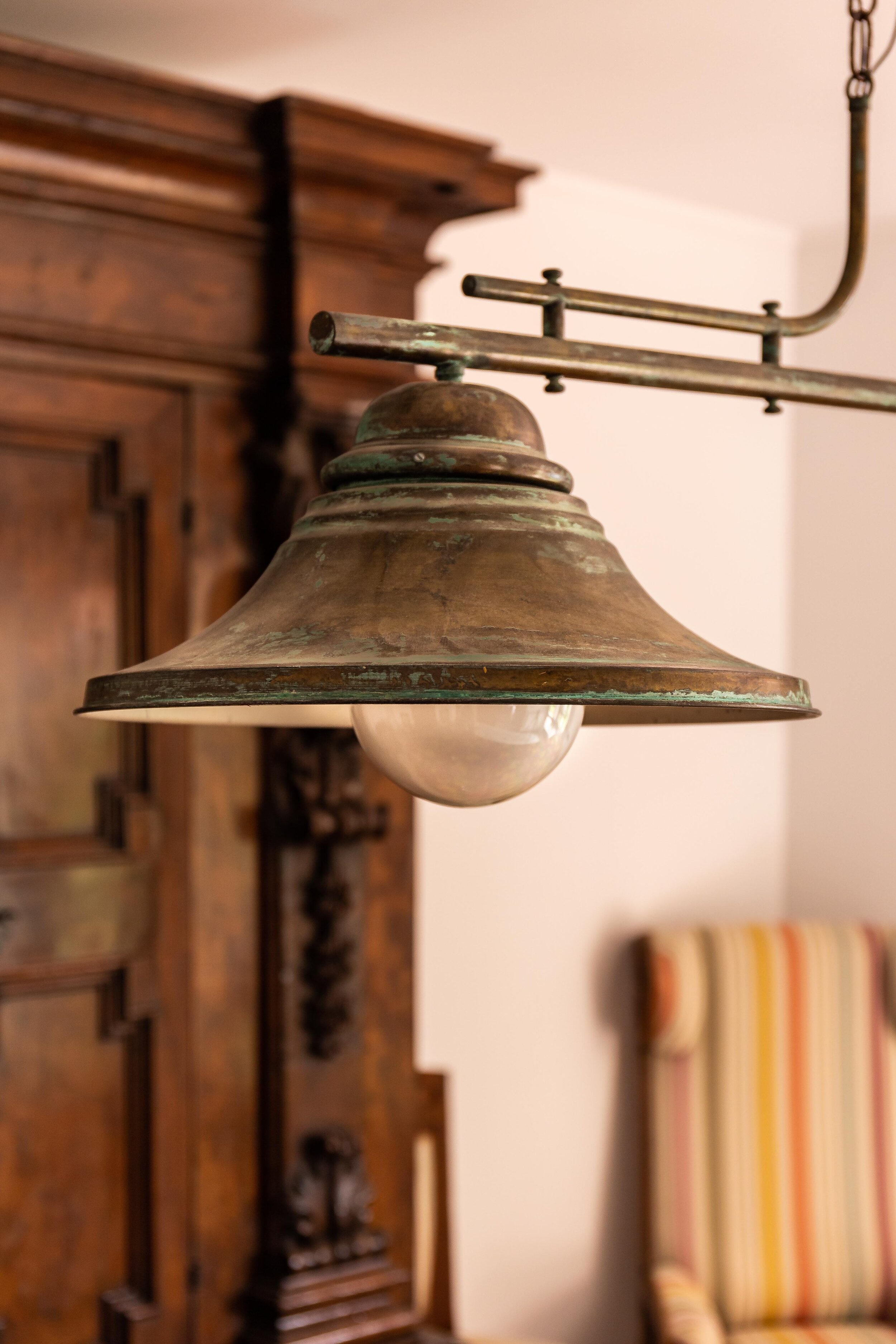
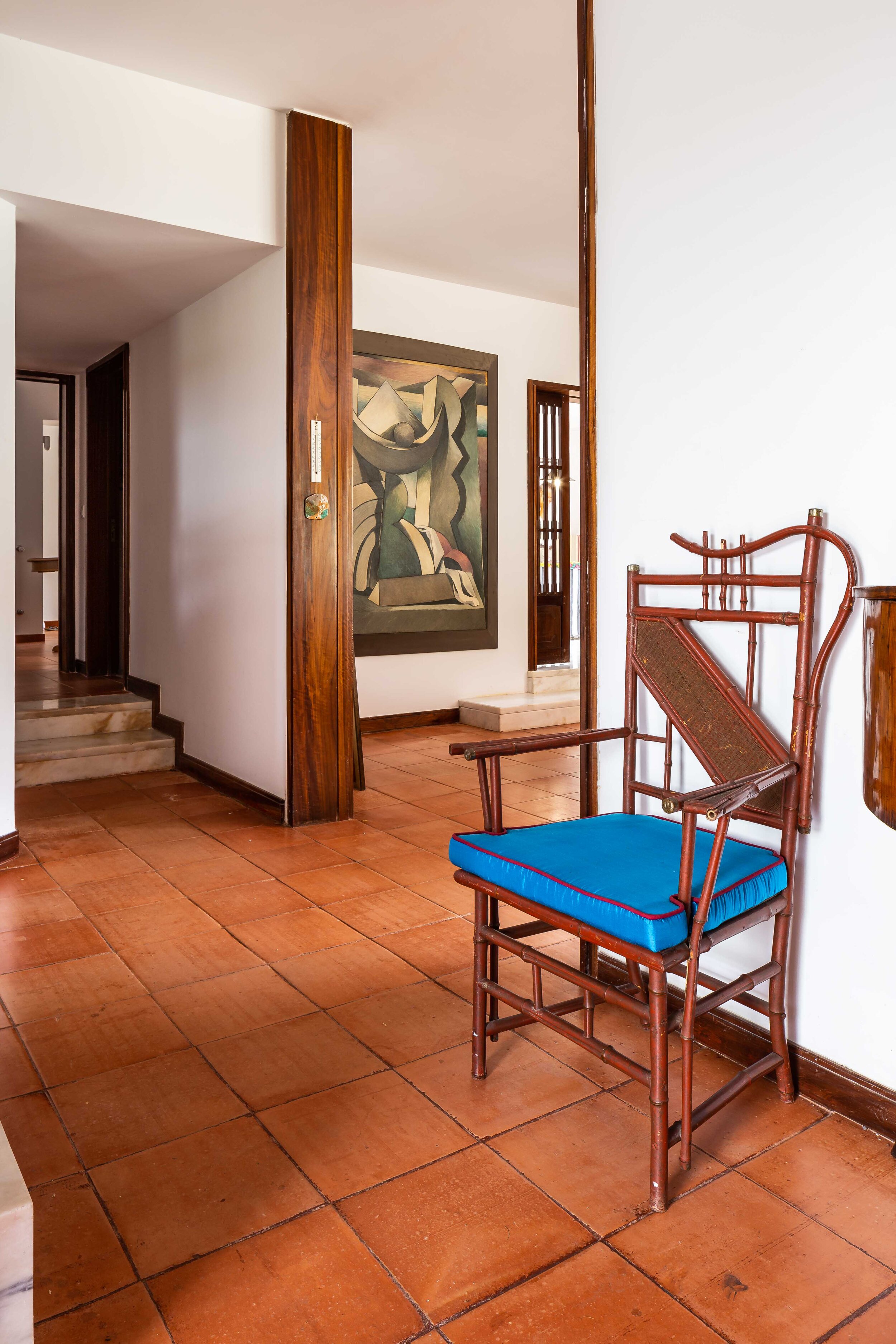
Occasionally, the brief goes deeper as was the case in a recent residential shoot I was commissioned for. The owner of a large historic property was making plans to downsize but wanted to have a detailed record of the house they love as they remembered it. Besides it being a fantastic example of bold 70’s portuguese architecture in its own right, it was also packed with antiques, furniture and decorative pieces collected over many years, and a wonderful fireplace at the heart of the home.

On the day of the shoot I was given freedom to navigate the house to my schedule which meant I could select the best time of day for the interiors and sneak in a few twilight images featuring that wonderful fireplace. I was fortunate to have an overcast day (rare in Lisbon!) with a beautiful soft light filling the property and I opted to stick to this natural light only to document the details with as much realism as possible. Also, no staging or moving things about - This was all about capturing the space as it is/was. Pretty much all the images in the set were taken with either a 24mm Tilt-shift or 50mm. A simple set up and a joy to shoot. Most importantly, a very happy client who now has a set of images that can transport them back to a different time and place.

Please get in touch if you would like to record memories of a place that is special to you or someone you know.

Unsung heroes

Details: filling in the gaps

Stairway alternative view

Stairway alternative view

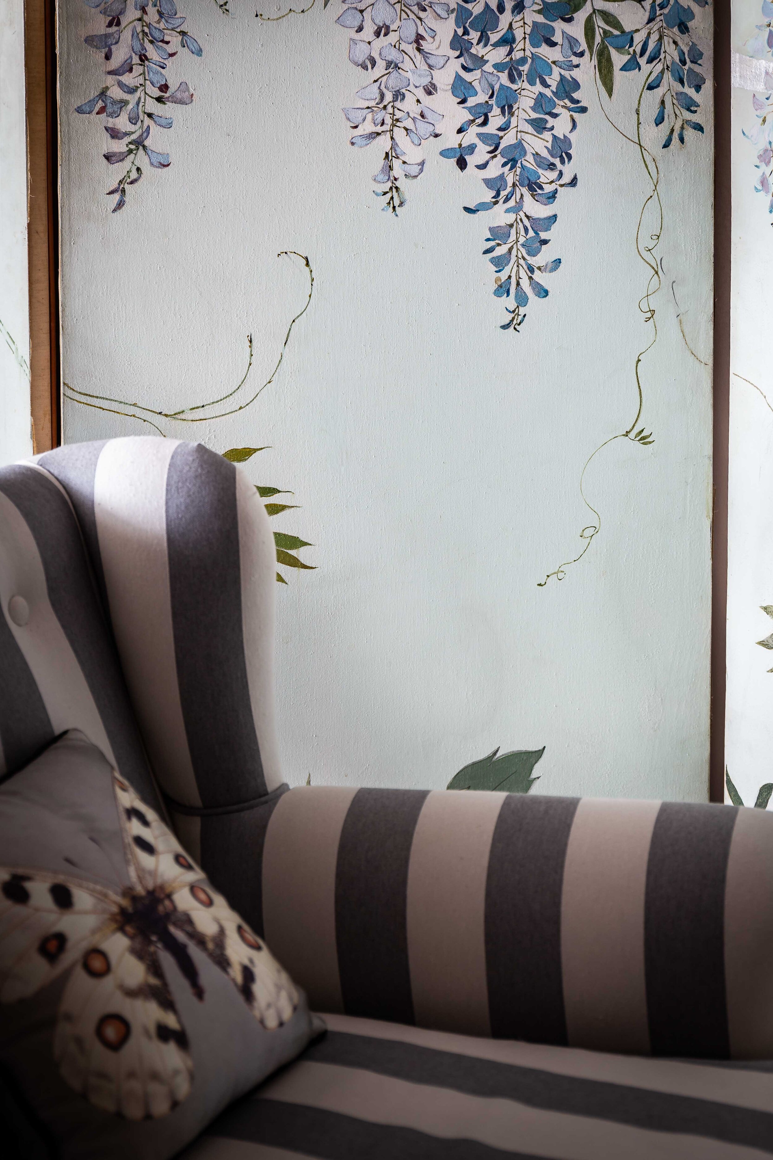
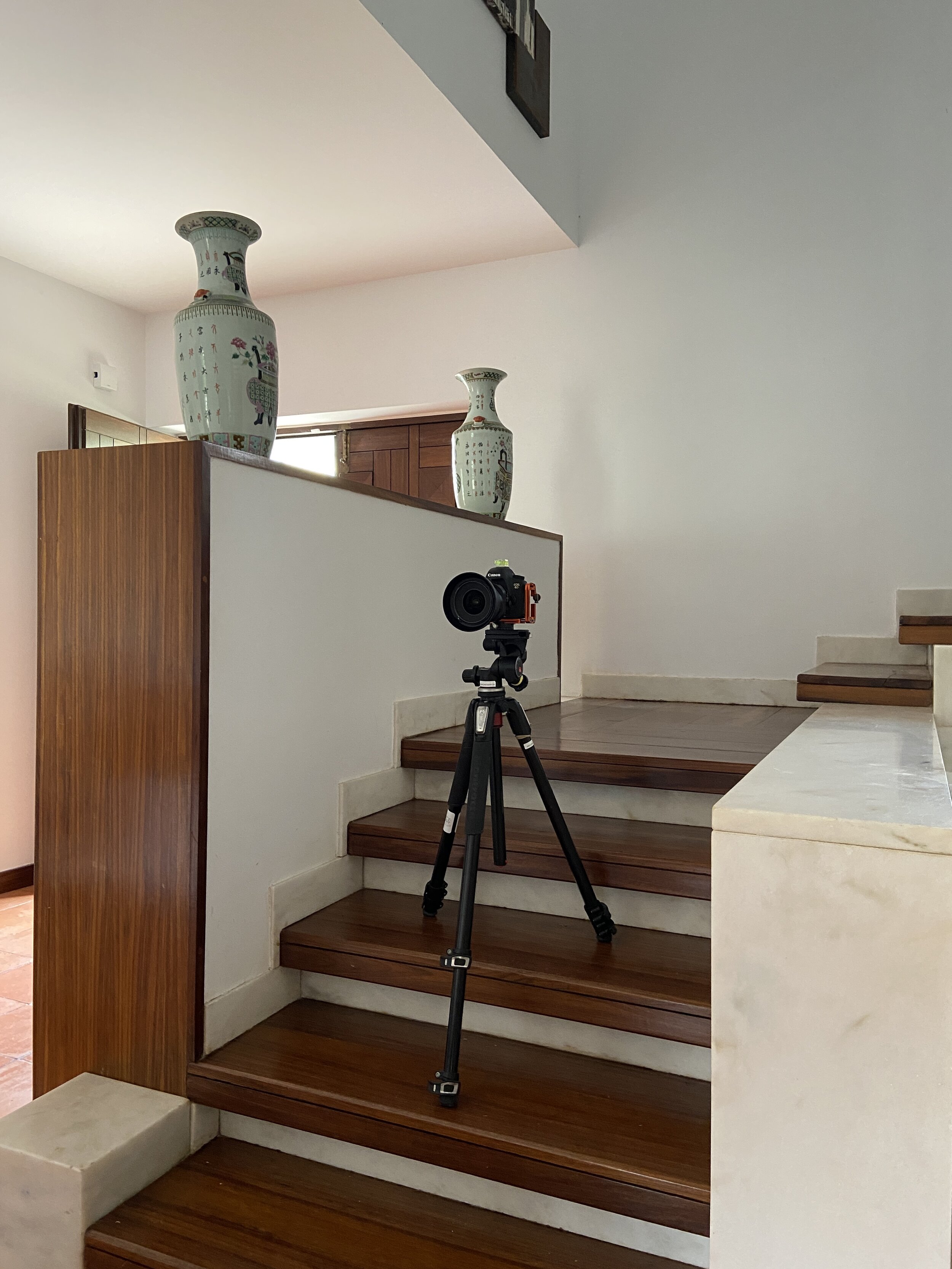
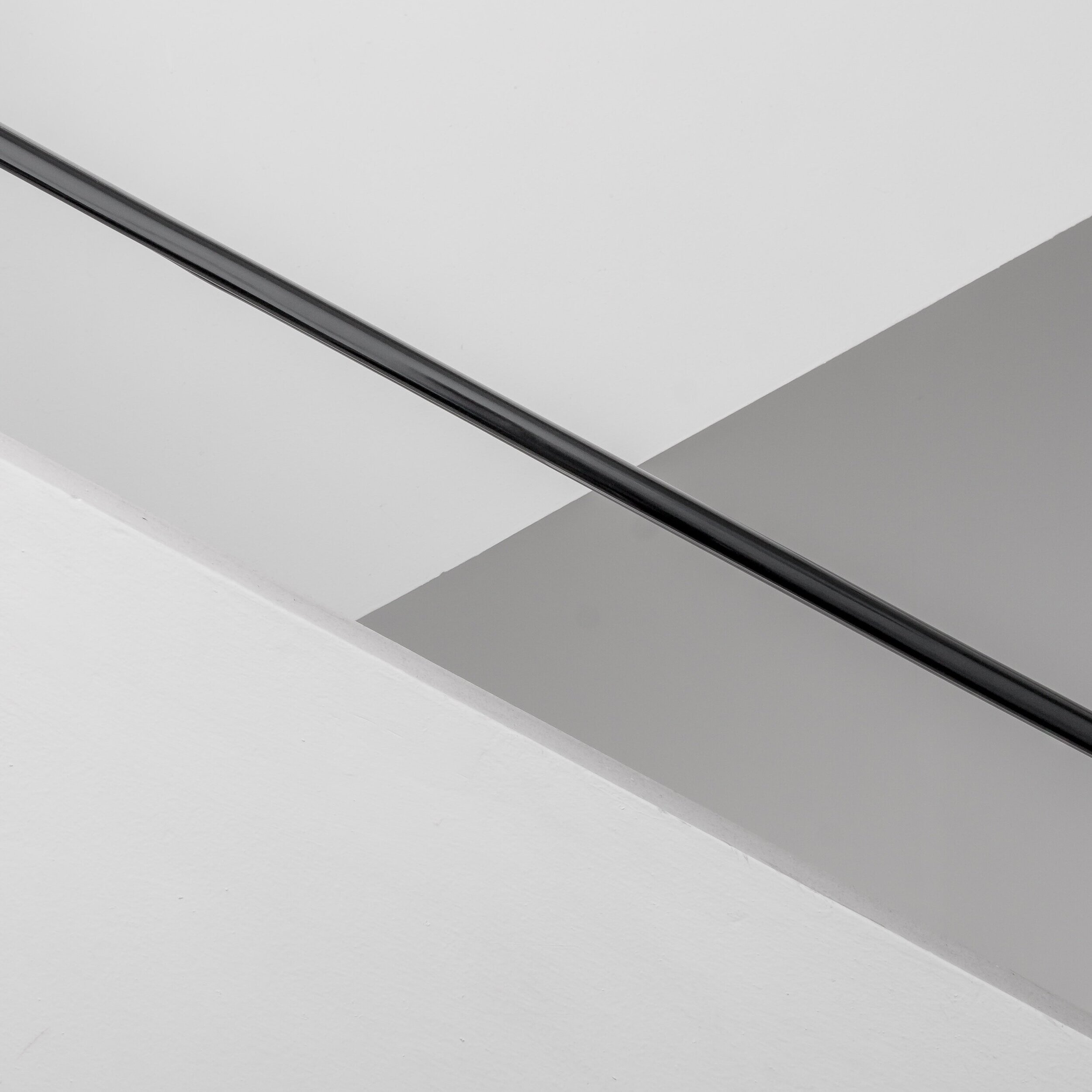
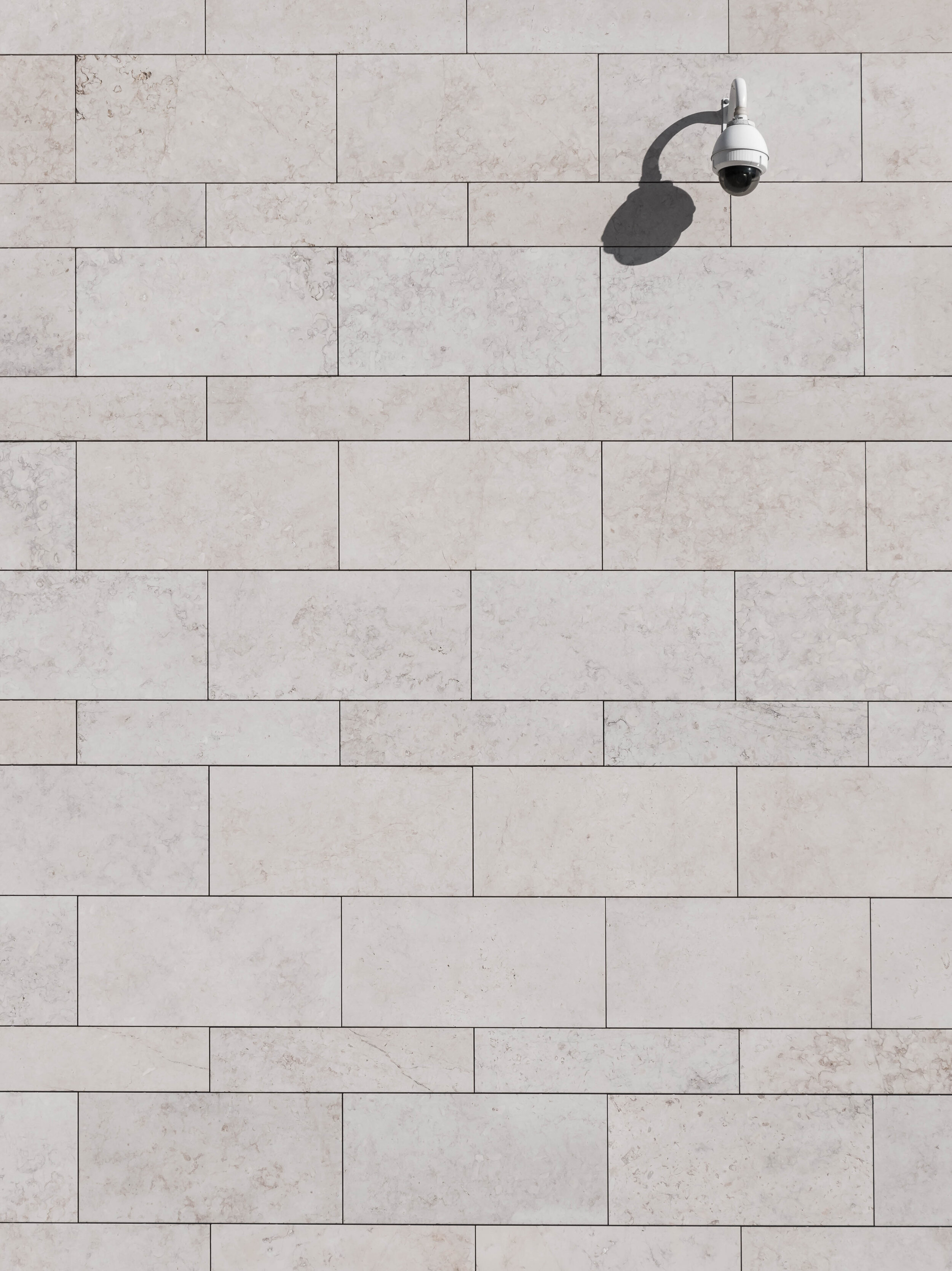
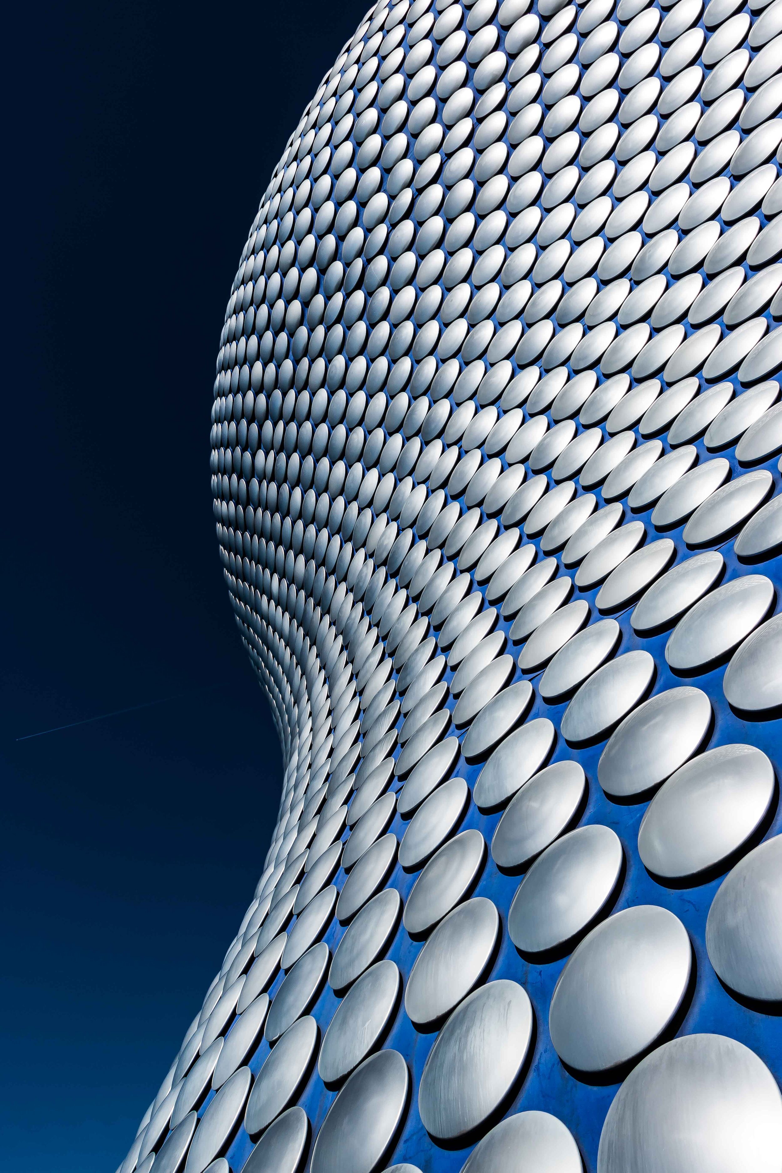
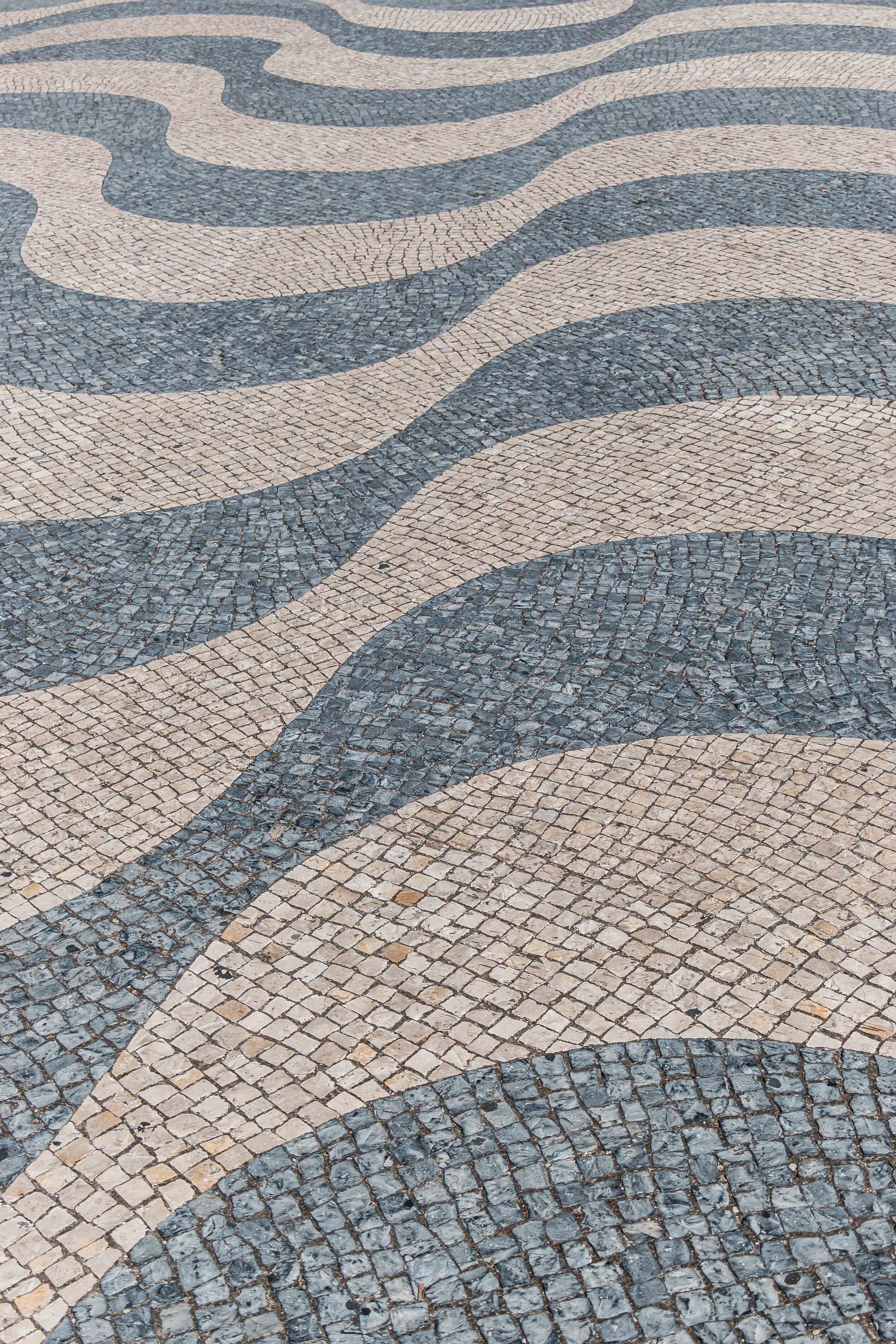
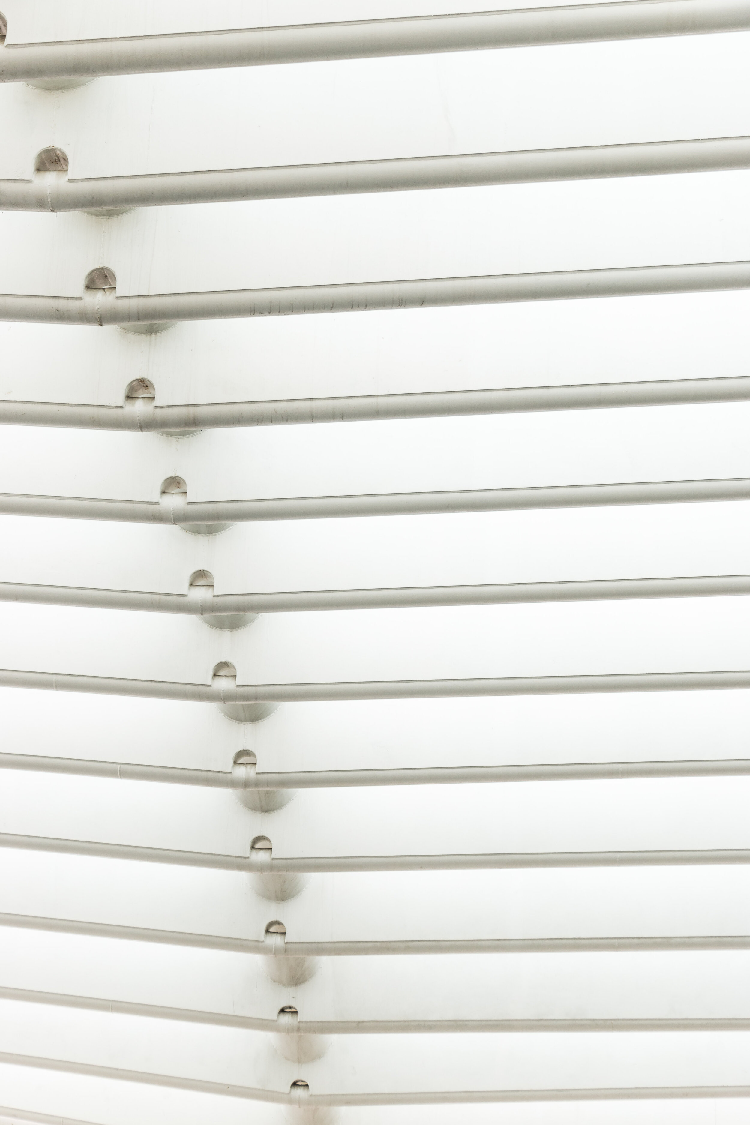
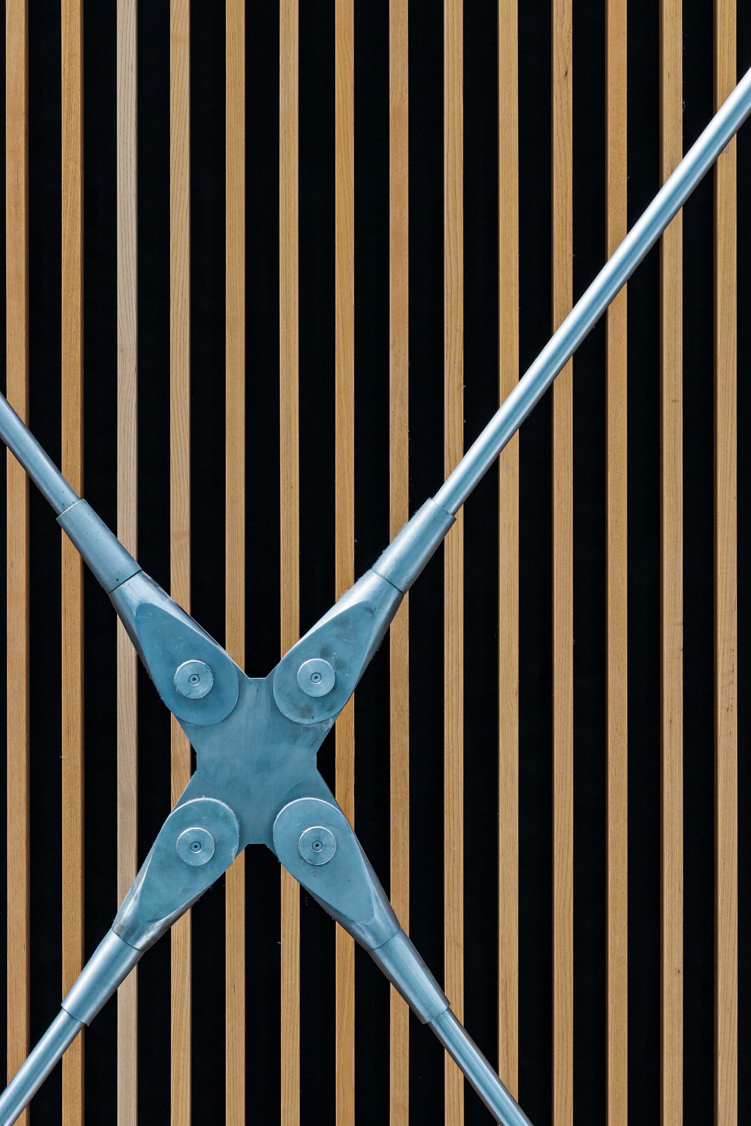
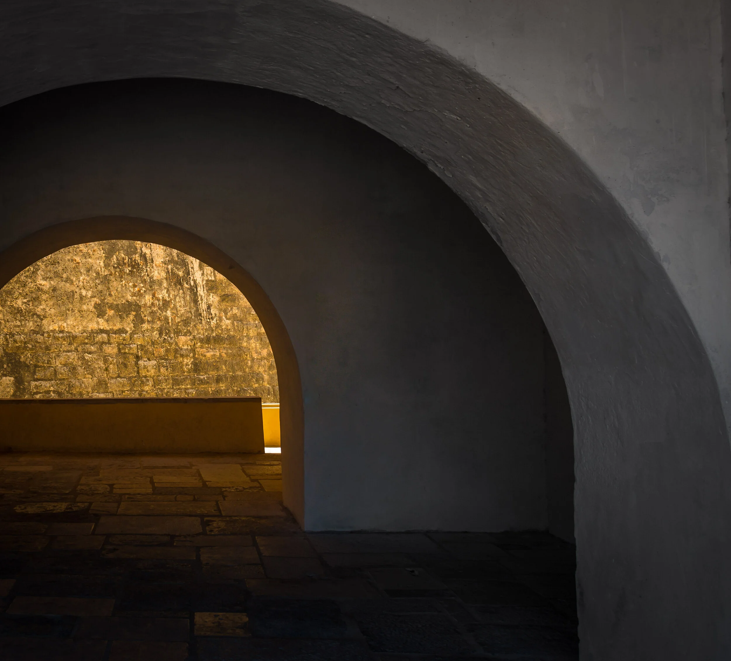
One of the “jobs” of an architecture photographer as I see it, is to throw a spotlight onto the elements of design that get missed as we all rush about in our busy day, heading to meetings, chatting to friends, or checking messages on the go. We take in our surroundings in different ways and our brains regularly fill in the detail that we didn’t quite have time to explore, but the designs, structures and buildings that we walk past are the sum of their parts, big and small that have been carefully considered and painstakingly installed to create the finished article. They are like unsung heroes and it is often these smaller details that I search for when I explore and photograph the built environment. Once you start looking for these details, you can’t unsee them! 

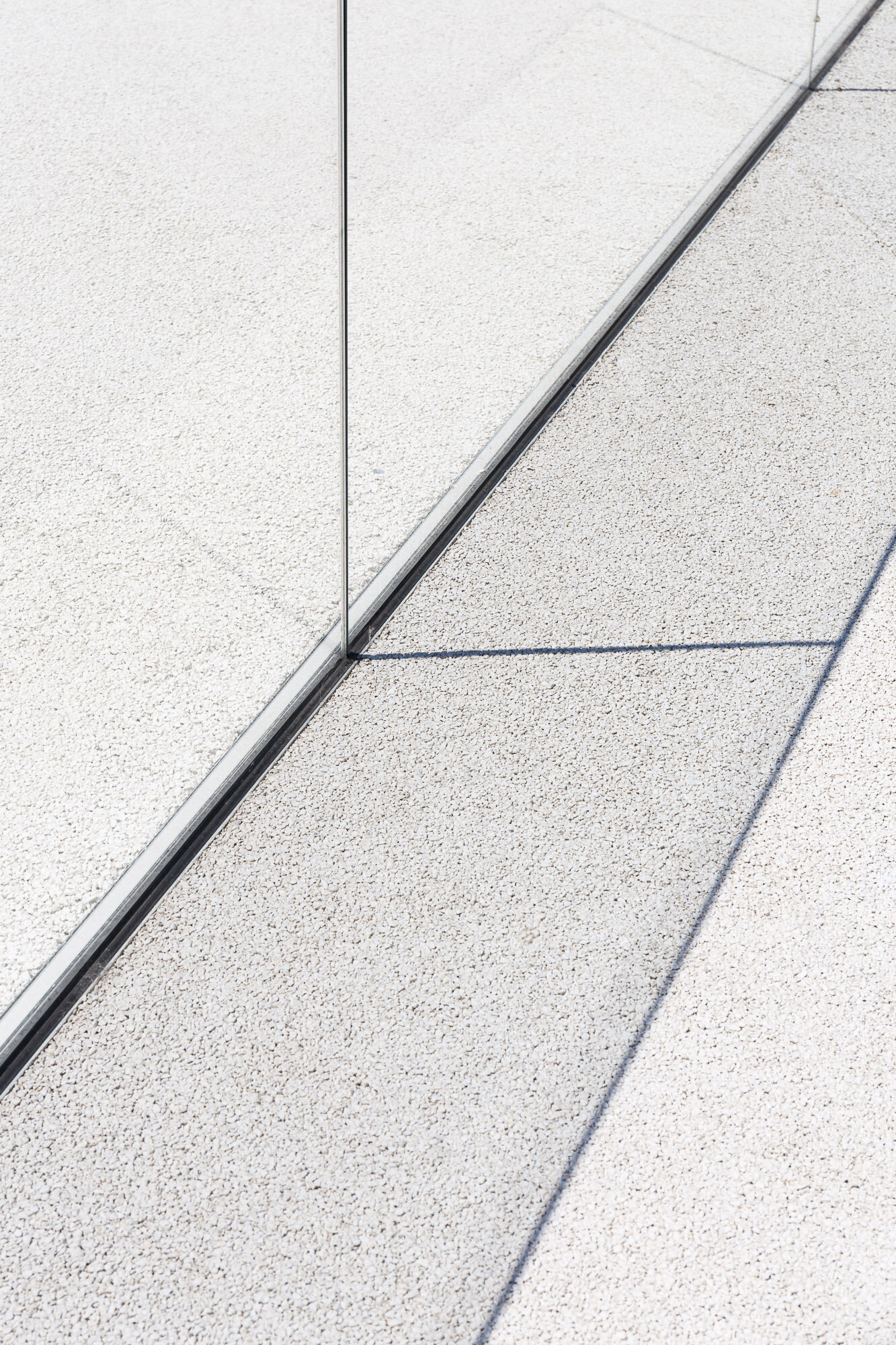
Sometimes these elements are in themselves little works of art. Other times, a bit of creativity in composition is needed to highlight that they exist at all. Finding repeating patterns, strong geometrical relationships, texture in materials, reflections or advantageous light can all help to amplify these aspects of a design whether they were intended to be viewed in this way or a happy accident. Taking the time to walk through, in and around the subject can reveal these little gems but crucially help to plan how to show them off in the best way - lens choice, camera position, time of day, interplay with people, use of supplemental light (or blocking it), post-processing are some of the tools I use and the decisions I make to help others see what they might otherwise miss.

Of course in cases of commissioned work, there is a brief to follow which will vary depending on the goal that my client is aiming for. In capturing architecture photographs of a large infrastructure project, public space or residence, usually the hero is the whole structure or large elements of it. For interior design photography in the hospitality sector, the finer luxurious details and furnishings help to entice customers to visit and can form a larger proportion of the shot list. 

Architecture requires careful attention to details, and therefore photographing it needs that same level of consideration to deliver a set of images that celebrates those details. My job is to help others see your designs the way you intended.

.pt

Clear Space Photography now based in Lisbon, Portugal!

Carcavelos-restaurant-exterior-architecture-clear-space-photography.jpg

All change! Well, quite a lot of changes in the last few months, the main one being a full relocation to Portugal and the wonderful city of Lisbon. It has been a long standing aspiration for myself and my wife to sample another, different life and after first visiting Lisbon 4 years ago, the city has been on our radar as a place to move to. Fast froward to 2019 and after several reconnoissance visits, lots of research and soul searching, we have done it.

I can’t pretend it has been easy, especially leaving friends and family, but our new life has only just begun, we are a couple of months in and our little apartment in Carcavelos (on the coast, 20 minutes out of the city centre) feels like home. Spike (our ageing Boston Terrier) loves the sun and the beach and we are ploughing through all the administration tasks necessary with any relocation - just made that bit more challenging as we can’t speak any Portuguese (but we are working to try and change that)!

So the move means that Clear Space has moved too and is now operating as a freelance business serving Lisbon and the surrounding areas. Economic growth in the region, a progressive approach to architecture/design and a buoyant tourism sector across Portugal all represent opportunities for Clear Space to assist businesses and brands through the creation of photographic content that tells their story with impact. 

I am excited to forge new relationships and collaborations and take advantage of THAT light (I am not missing those grey days…).

If you’d like to connect to discuss photographic ideas, enquire about commissions or just to find out how my language skills are coming along, please get in touch. Obrigado!

Ninja skills!

Interiors and architecture photography of a unique commercial space

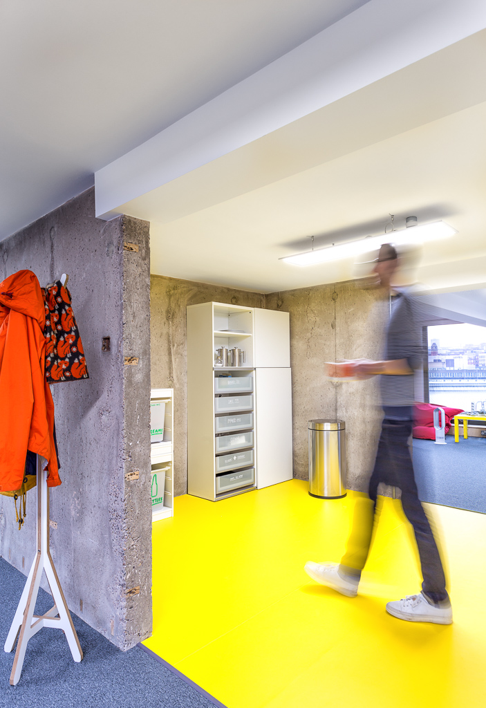
When you are in the groove with your work or a task, you can cover a lot of ground and get things done but interruptions and distractions can have the opposite effect (like re-reading the same sentence ten times and it still not registering!). As a location-based architecture and interiors photographer,  I can be tasked with capturing images of real working environments. Spaces devoid of humans can work in some situations, but sometimes having people in the frame helps the narrative: what the space is used for, how we interact with it, providing scale. But, the last thing I want to do is to cause disruption to my clients’ business and annoy folk trying to do their work. So, this is where the Ninja skills come in… I don’t mean back-flipping around a site clad in black, but operating efficiently, discretely, with awareness of the surroundings and sensitive to those working in it. At the core of this is pre-planning and scouting before a shoot takes place.

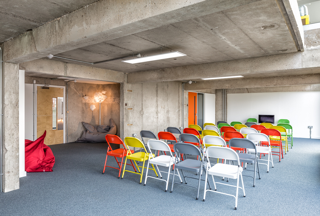
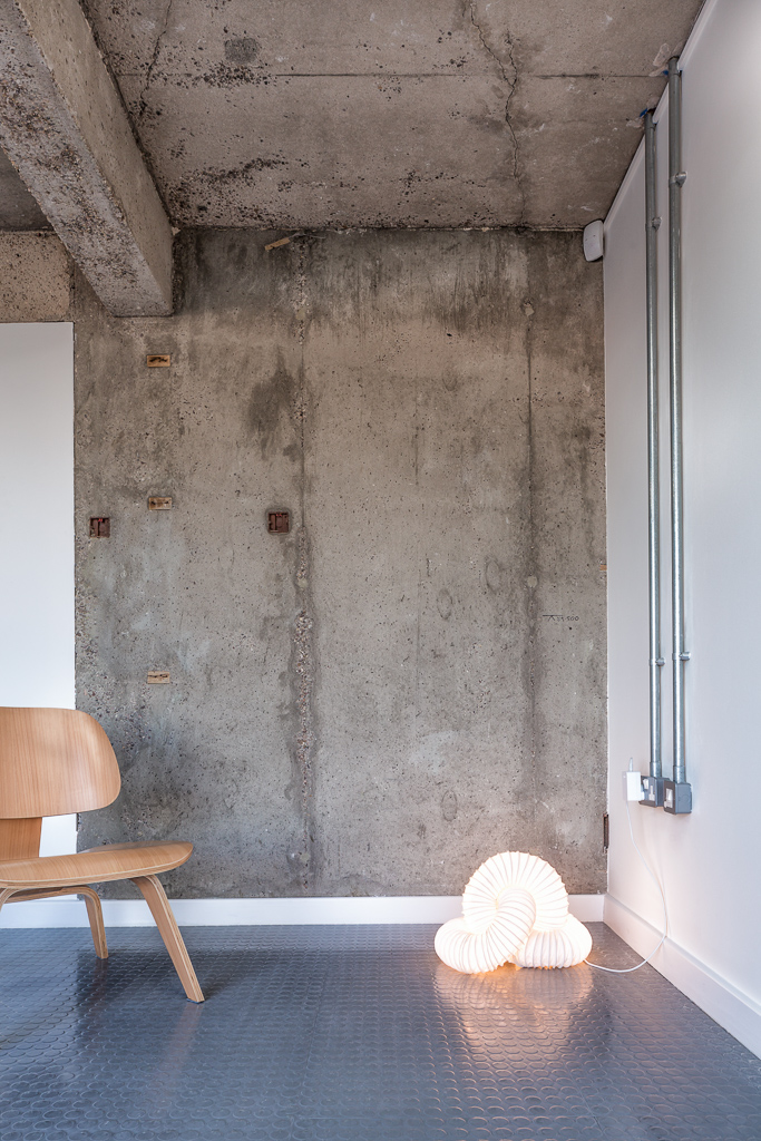
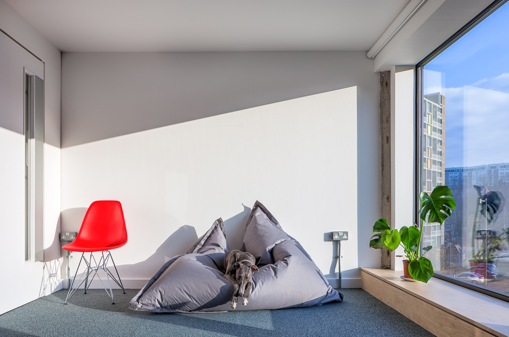
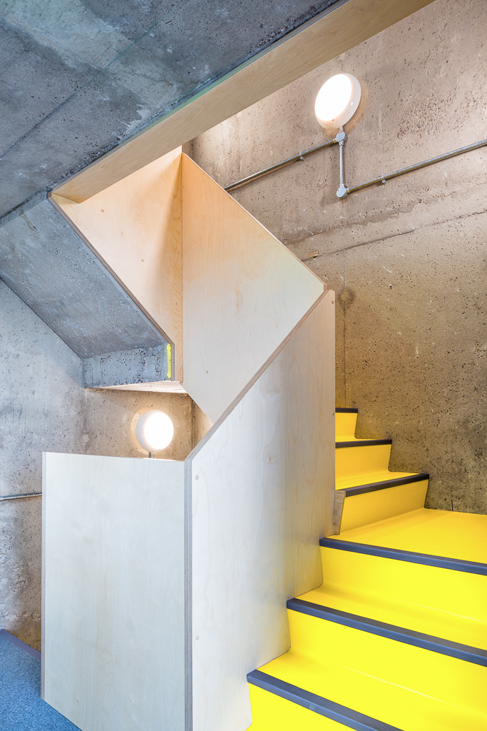
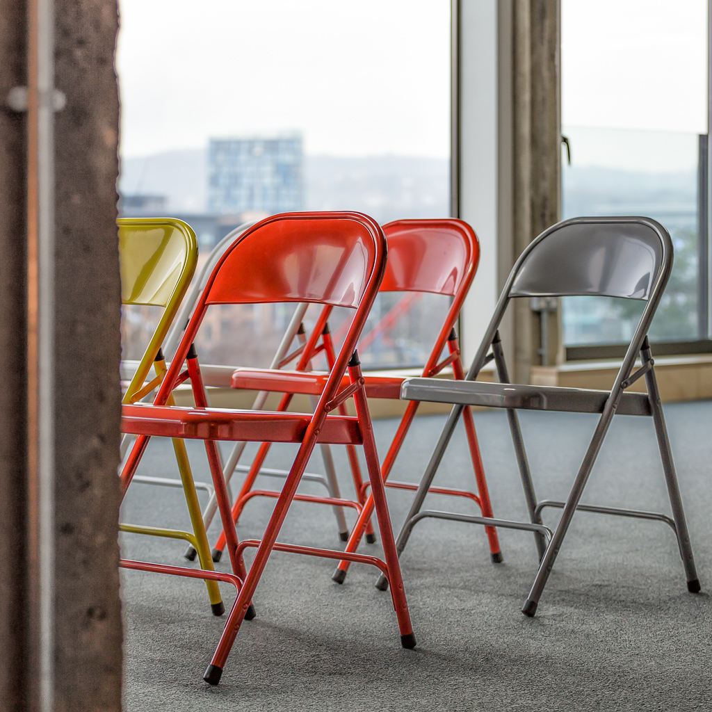
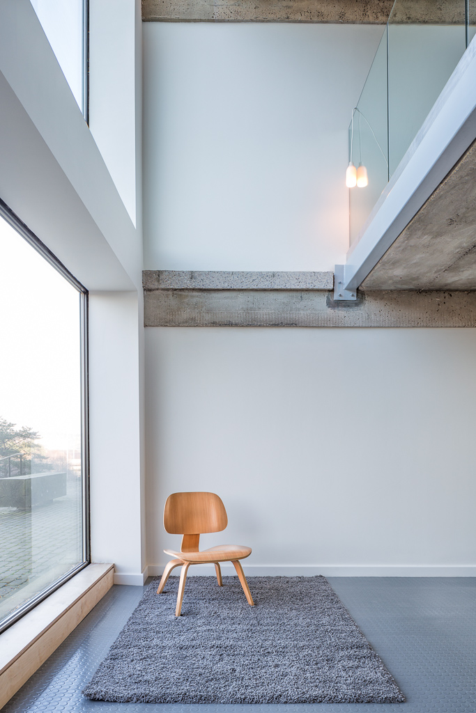
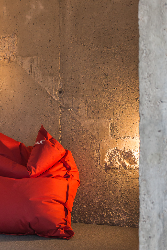
A while ago, I had the opportunity to shoot the unique interior of a working commercial space in the iconic Park Hill development of Sheffield. This behemoth of brutalist architecture has been brought back to life to suit modern living and working thanks to the vision of Urban Splash. With the first phase complete, there are now a range of commercial and retail units occupied below the towering residential apartments above. One of the early adopters to the office spaces has been Yoomee, digital researchers and designers focussed on helping non-profit organisations.  Founders Nicola and Andy were visionary in taking the bold step of moving their business into new premises  and have worked to create a unique work space that suits their needs. The offices span the base of the tower with dual east and west aspects and house work spaces, meeting rooms and breakout areas across two floors. The fit-out (Ovo Spaces) has celebrated the brutalist fabric of the original structure but with modern fixtures and fittings and vibrant splashes of colour injecting energy and fun. 

With a complex, occupied workspace such as Yoomee, a scouting trip to site is invaluable. It gave me the chance to understand the space, direction of light according to time of day, build a shot list and meet some of the team there. It helps me to consider my equipment choices and helps to remove any surprises on shoot day. This way, I can get in, make like a Ninja and complete the shoot. For the most part, I was able to work tethered to a laptop (our preferred approach) allowing ‘live’ tweaks to composition, framing and exposure whilst providing an instant back-up of assets. Some of the spaces required panoramic stitching of images made easier with the Canon’s tilt-shift lenses, and thanks to the enormous windows and a cloudy day (lovely soft light), little need for supplementary lighting. It was a really fun shoot of a great space, made all the more enjoyable thanks to Rich Wells who helped shunt some furniture about and kept me caffeinated.

A scouting trip to your location is a valuable exercise to help us formulate the right approach to meet your brief. If you are thinking that your work space or business deserves to be shown off in the best way to your clients and customers, drop Clear Space a message or give us a call. We would love to discuss your ideas and help you plan a photo shoot that delivers (back-flips not included).