Interiors photography for a physiotherapy practice
The Green Room
A visit to a healthcare establishment is most likely coupled with some form of anxiety (it certainly is in my case!). However, besides quality practitioners able to look after us, the environment is also an important factor that can influence our emotions and our mind-set even before any treatment takes place: Is it clean? Is it old? Is it cramped? Where do I go?
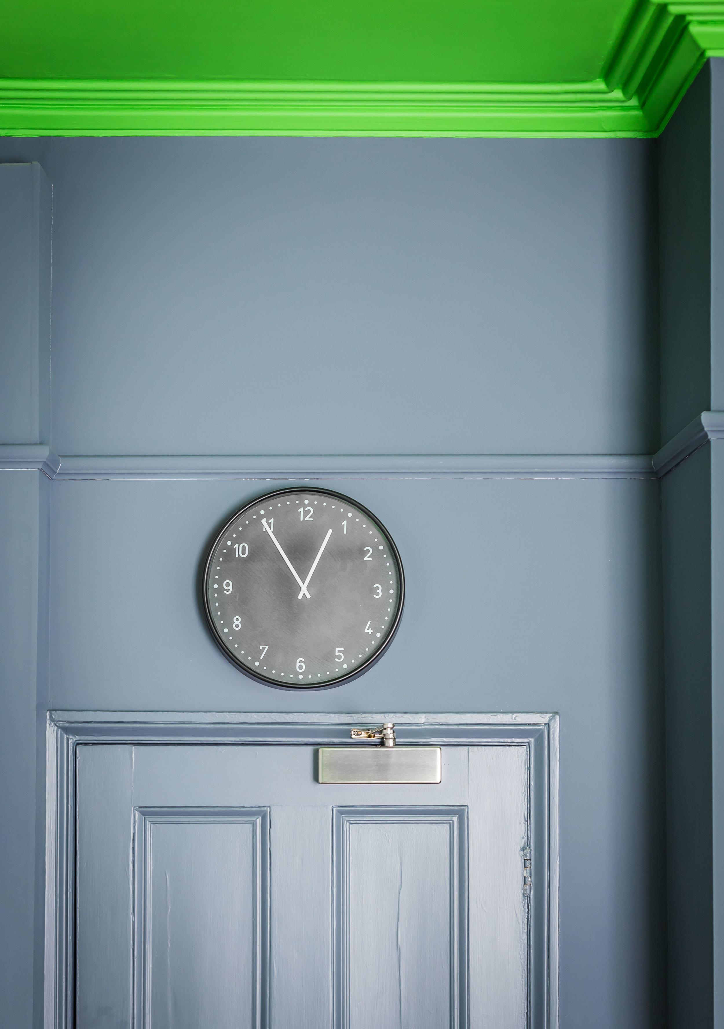
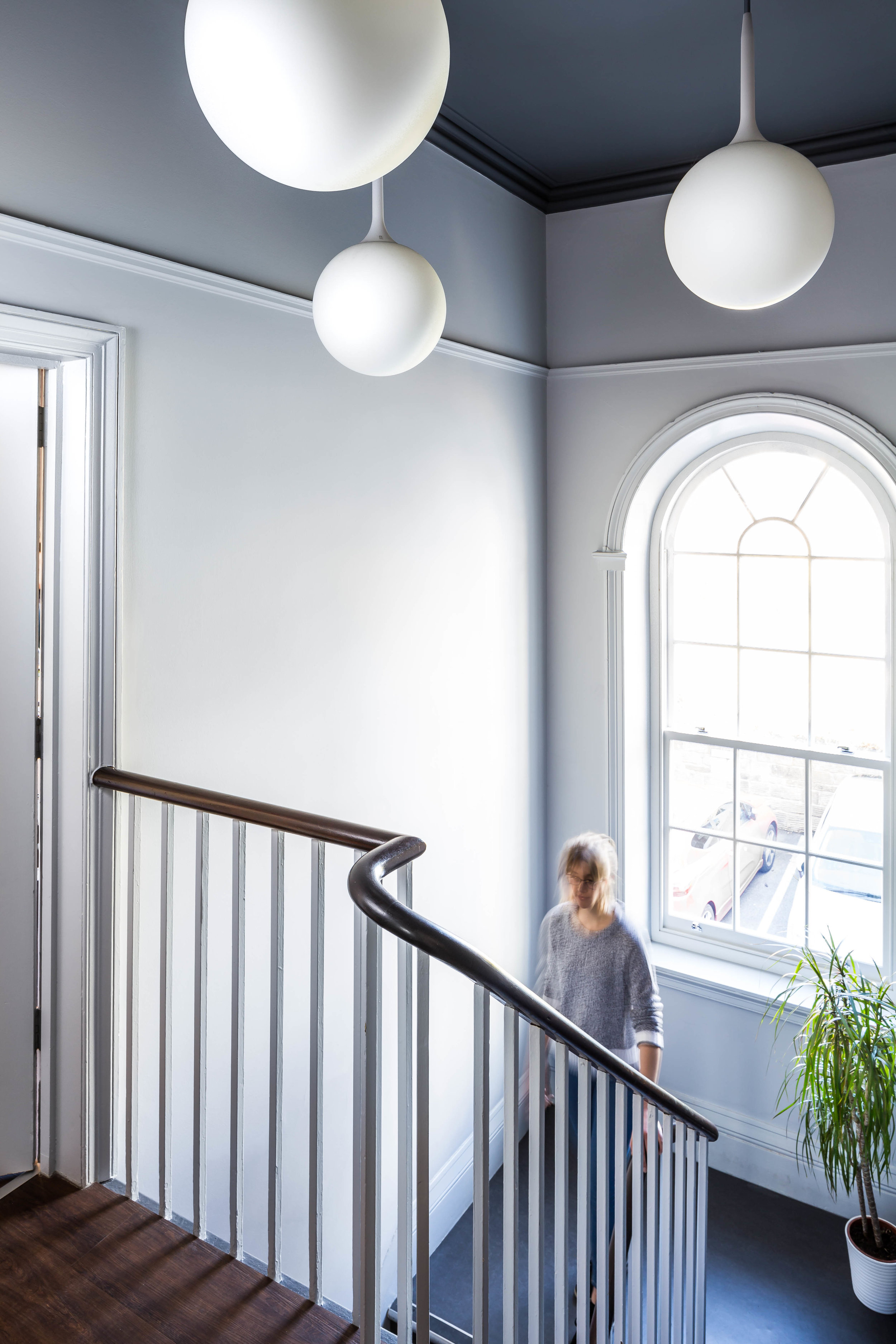
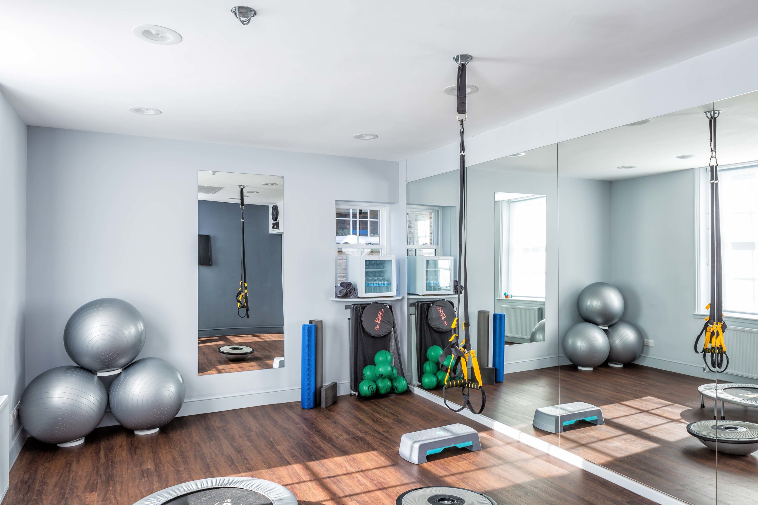
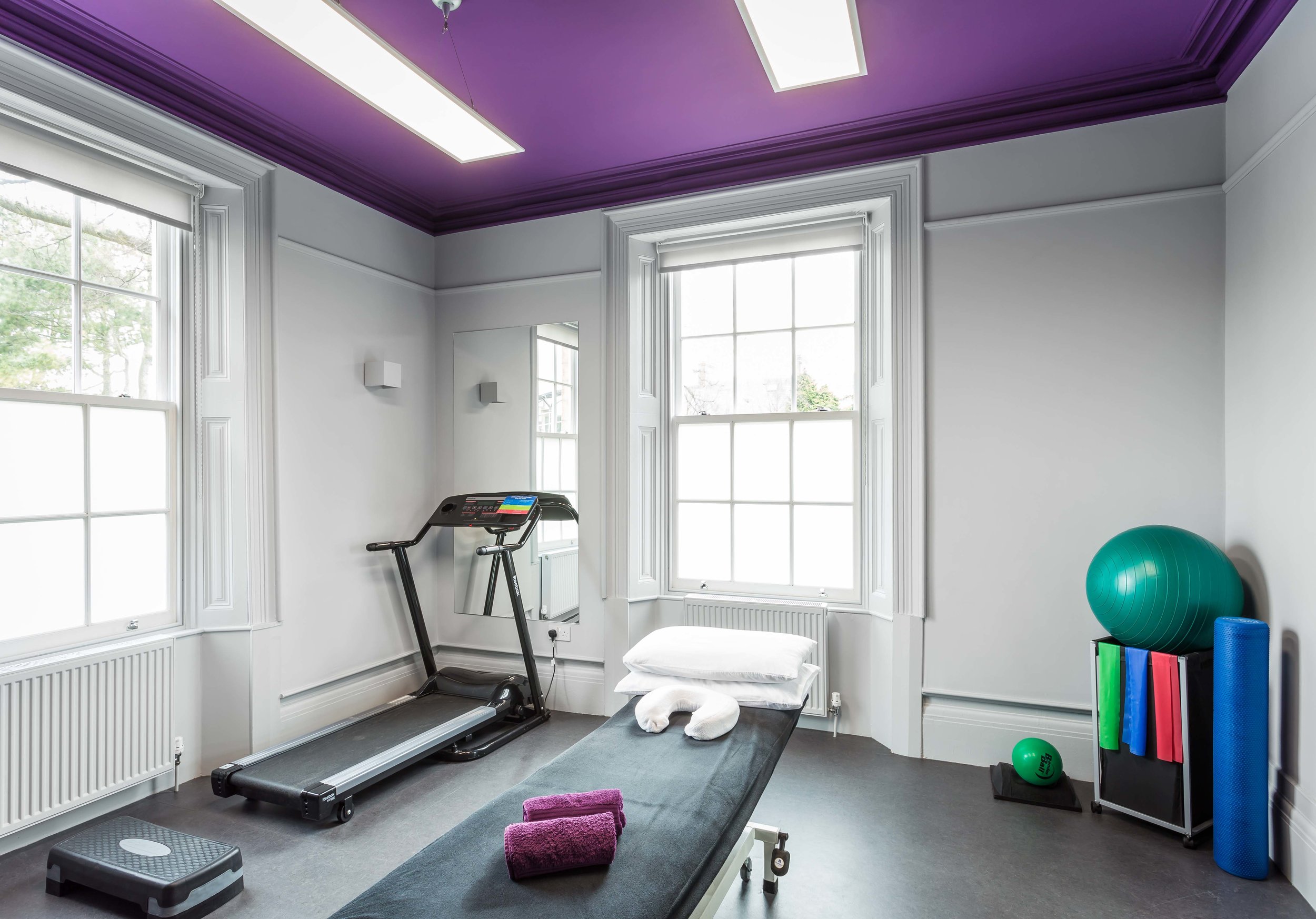
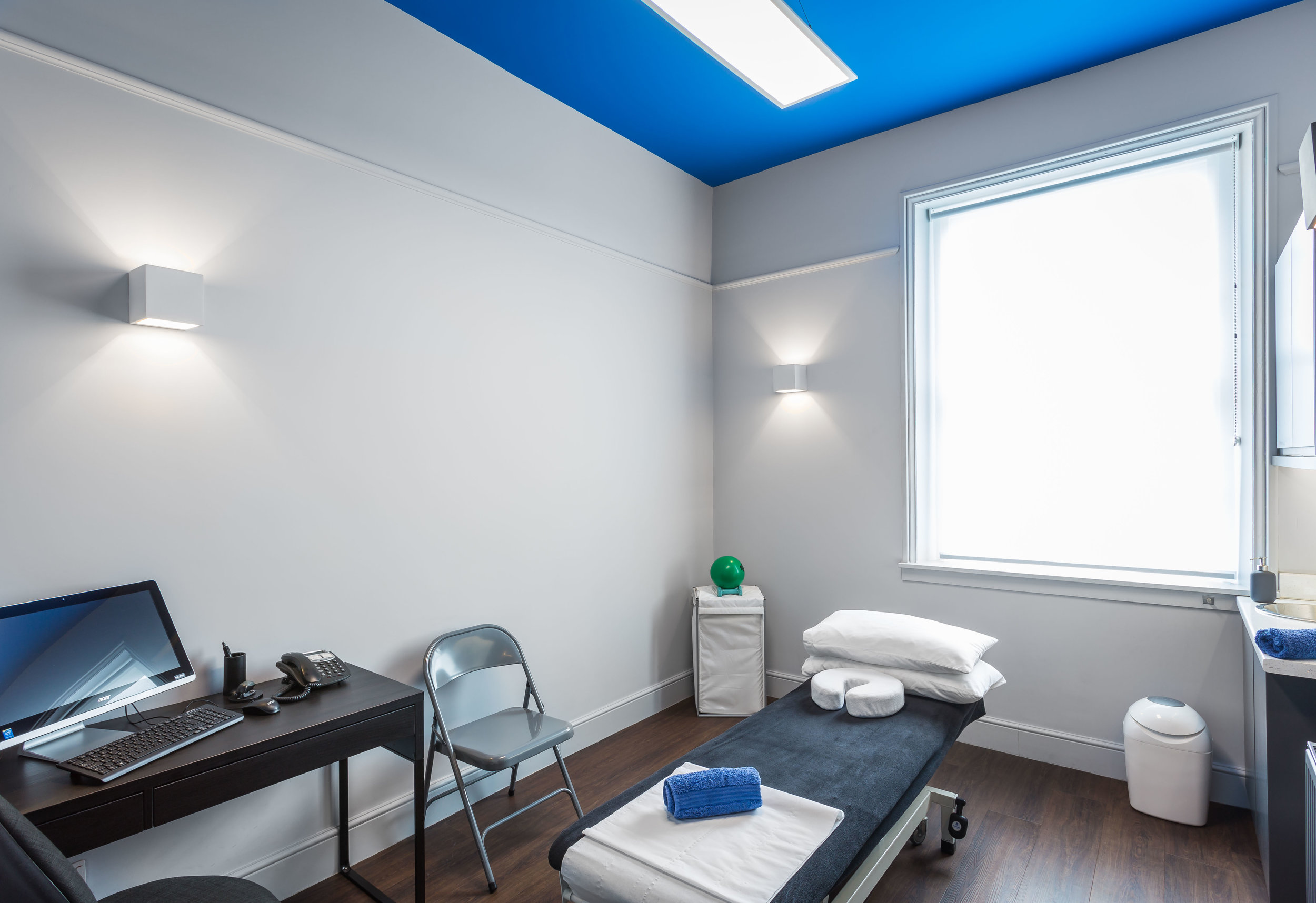
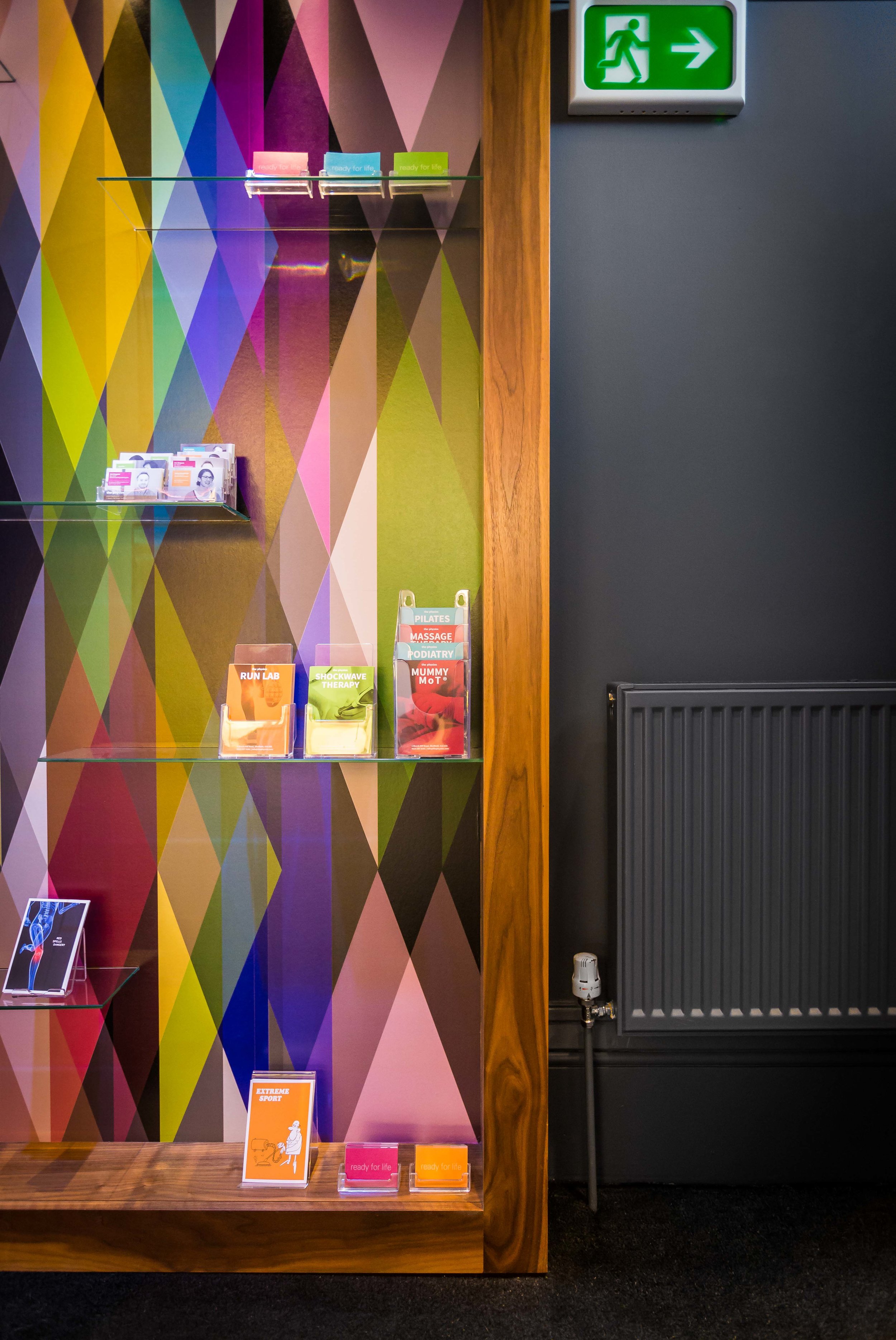
Having had the opportunity to work with the team at The Physios in creating a set of interior images for their practice in Sheffield, my own perceptions of how interior design plays an important part in the healthcare setting has changed. Paul Hattam (Principal physiotherapist and Director) explained how they had transformed an historic building into a set of functional and stylish treatment rooms, reception area and studio to support their services, but had taken efforts to move away from the more traditional branding associated with physiotherapy practices (think clinical blue and white colour palette) in favour of a more contemporary scheme coherent with their business and visual identity.
From entering into the bright, colourful reception area through to the colour coded treatment rooms and darker muted transition spaces between; there is an immediate sense of calm with a modern style that feels fun and luxurious but always professional. In short, it feels like a nice place to be which for a health facility has to be a good thing.
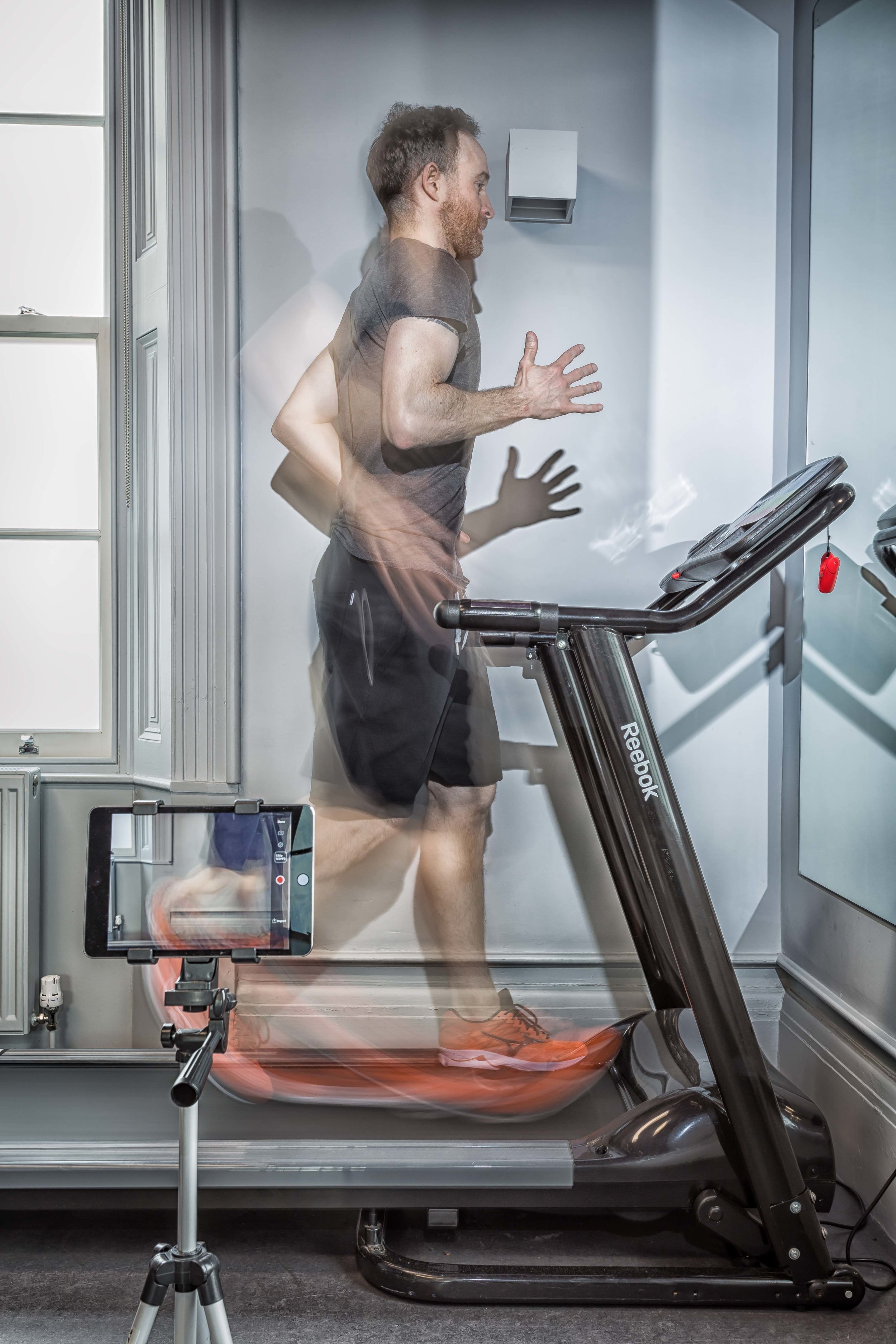
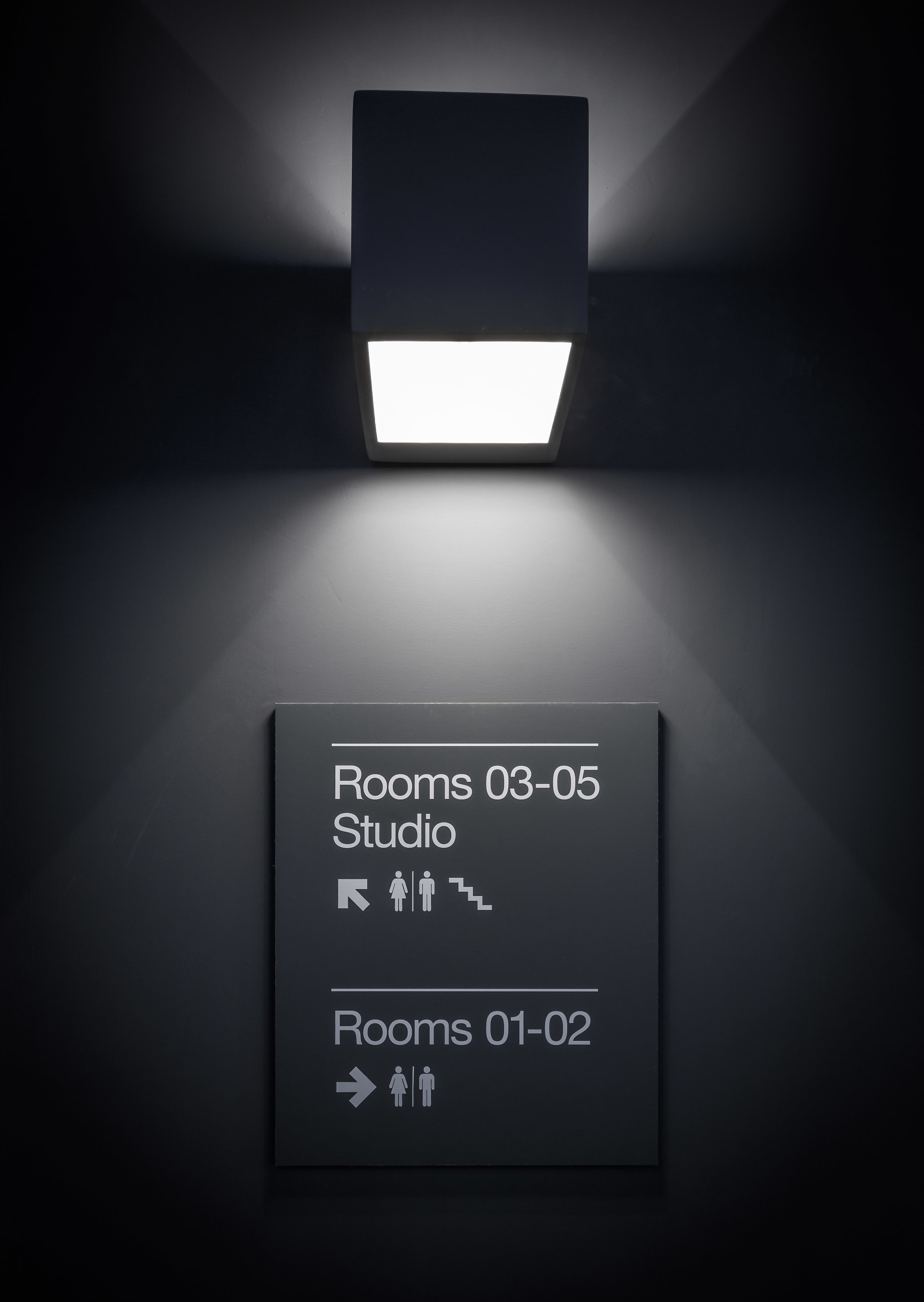
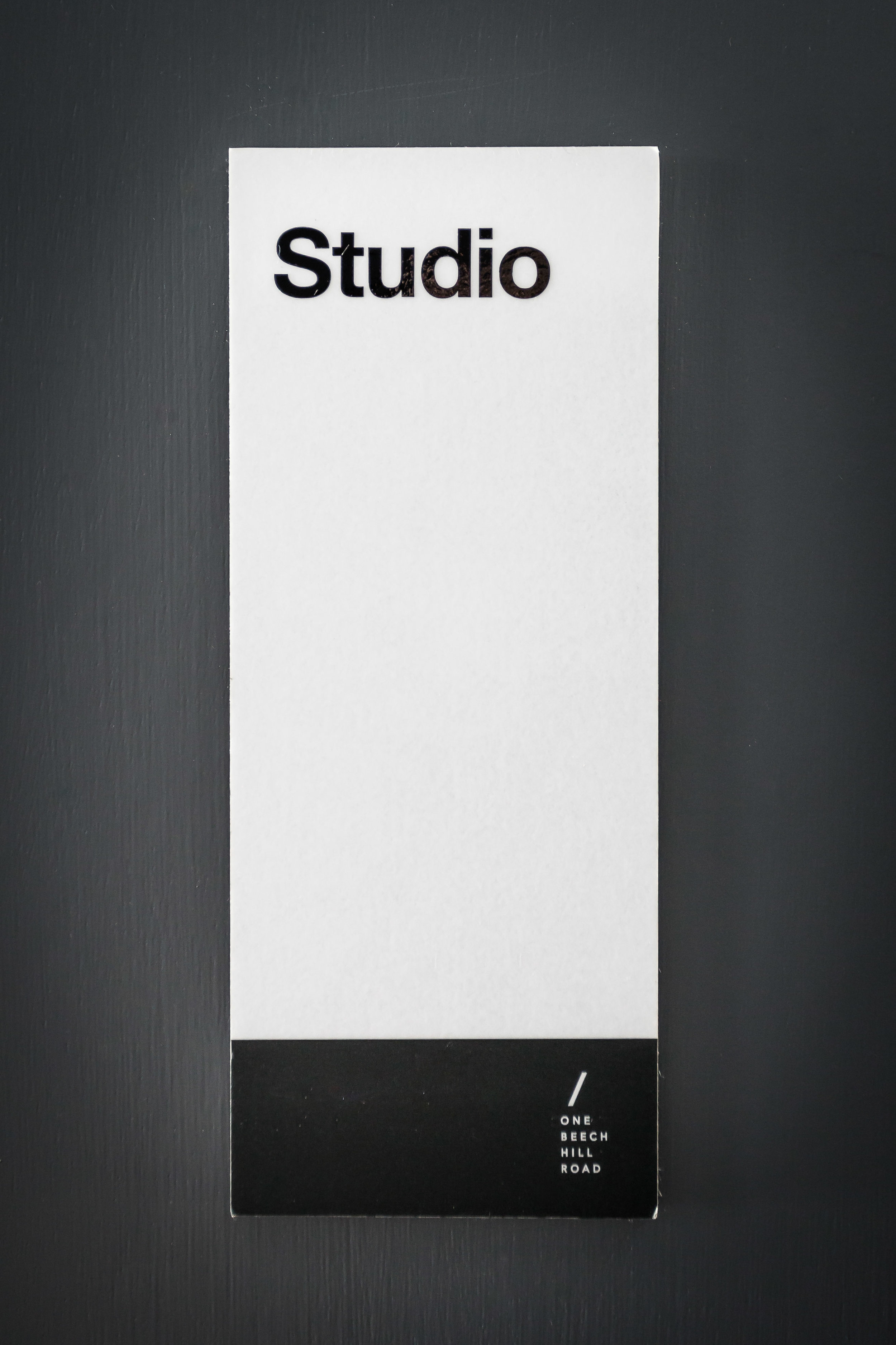
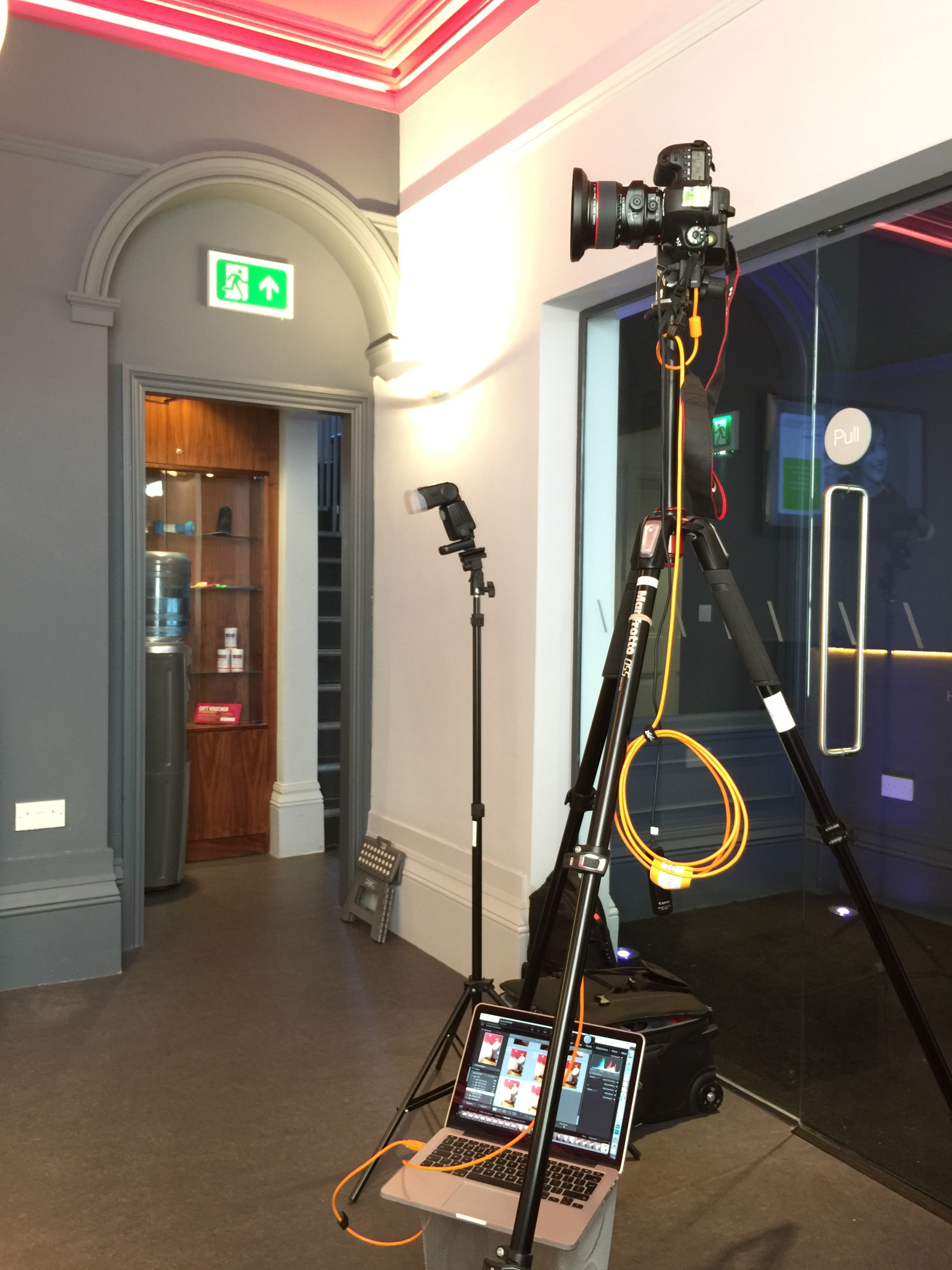
So my challenge in capturing interior images of these spaces was to represent the spaces true to form, yet highlighting the original use of colour and other design features and way-finding/signage throughout. The team had been helpful in scheduling my visit such as to minimise any disruption to normal business, yet still tied in with a good time of day to make the most of daylight through the south facing aspect the majority of the spaces share. A bit of room dressing/prop styling plus the use of a couple of staff members to provide human interest in some of the spaces helped to set the scene (particularly use of a treadmill in their run-lab!). Most images were captured with ambient light with occasional use of strobe to supplement in darker areas and to clean up colour contamination from those bright ceilings and walls. Shooting tethered (to a laptop) allowed me to check details, focus and get some client feedback on site before breaking down each scene. This is such a helpful tool in my workflow and allows on site collaboration, instant backup of digital assets and gives me absolute confidence that the shot list is complete. In post-production, some minor tweaks to white balance/colour temperature, some blending of flash and ambient frames using Photoshop, re-touching/cleanup work and perspective corrections for shots where I hadn’t been able to use tilt-shift lenses.
Paul was delighted with the images which they are now using for their web/social/marketing campaigns, and I now know where my first port of call is should I need any treatments in the future! If you or your business have a space, facility or place that you are proud of and needs to be shared with your audience, specialist interiors and architecture photography can really make the difference. We’d love to hear from you.

